A month ago the major indexes broke down below their uptrend lines. They have since gained back all of their losses and then some. But that doesn’t mean everything’s peachy again.
In fact, I believe there’s a good chance that last month’s correction was only the beginning of a resurgence in volatility and very possibly could evolve into a major topping process for the stock market.
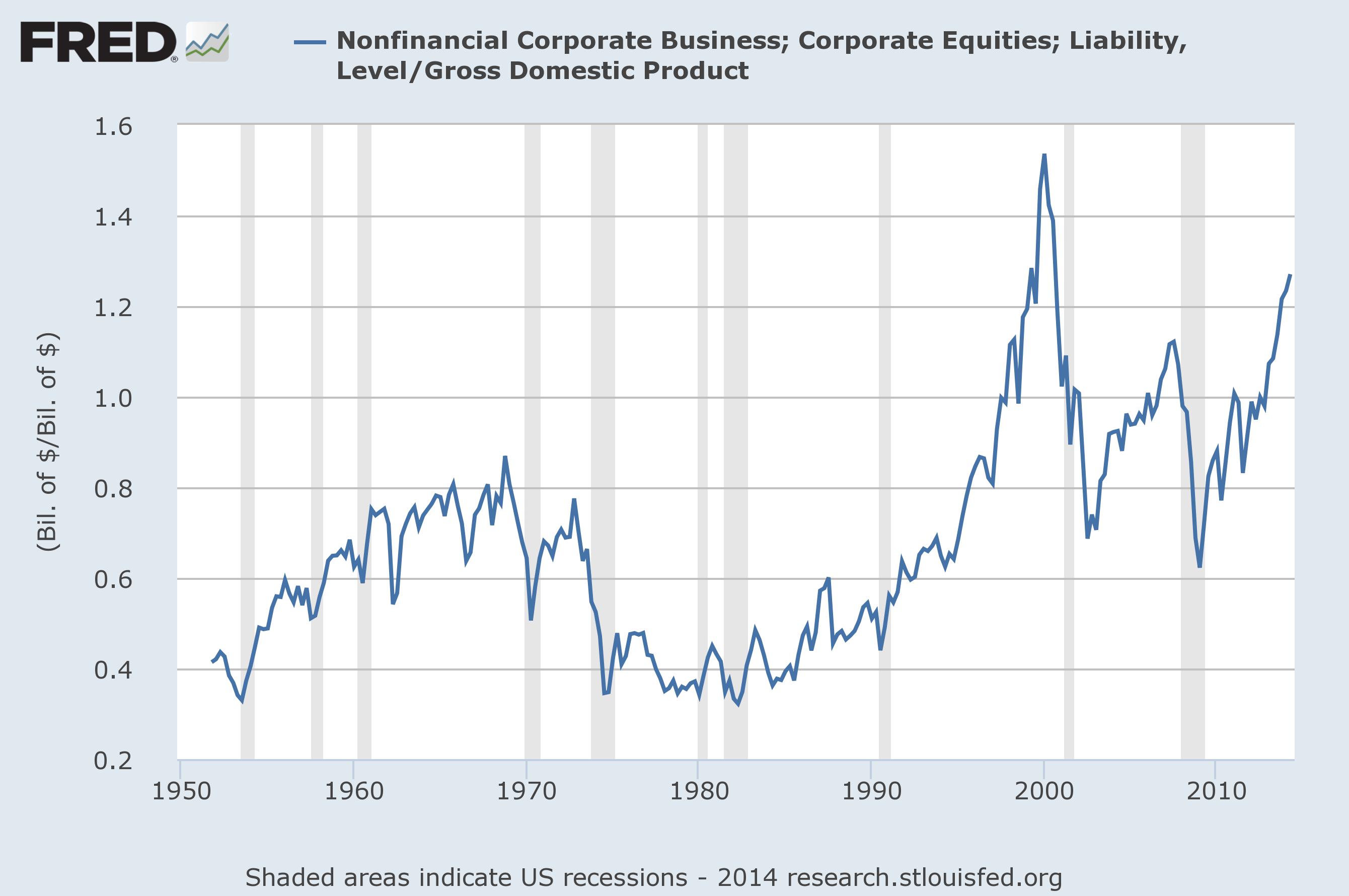
I’ve spent a lot of digital ink here discussing how overvalued I believe the market is currently. Mr. Buffett’s favorite yardstick, total market cap to GNP, shows the market to be currently trading at a level that is nearly twice its long-term average valuation. In other words, stocks would need to fall nearly 50% just to return to an average level, let alone an undervalued one.
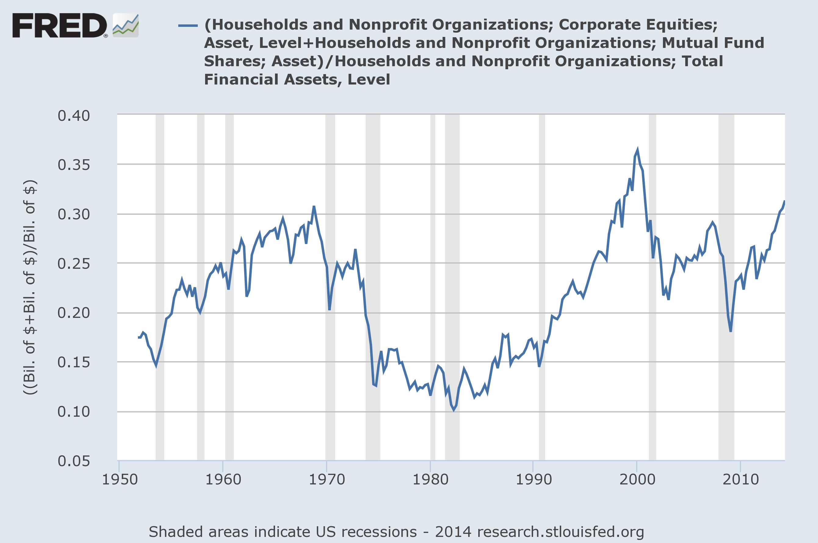
Sentiment is also stretched about as far as it has ever been. Investors could hardly be more bullish than they are today, based simply on the percent of household financial assets allocated to stocks. In the simplest terms, this means that potential demand for stocks is not nearly as great as potential supply (see Philosophical Economics’s terrific post on the supply demand dynamic in stocks).
While these two measures are very highly correlated to future 10-years returns in the stock market, they have very little utility in trying to time a market peak or even a correction. That’s why we have to consider the overall trend. Fundamentals and sentiment won’t tell us when the trend may be coming to an end. Only the market can tell us that.
And the market is sending plenty of signals that this may be happing right now.
The simplest way to analyze a trend is to see if prices trade above or below a simple 200-day moving average (approximate to the 10-month moving average) and/or draw a long-term trend line. (Meb Faber recently wrote an interesting piece on just how important the 200-dma is to hedge fund titan Paul Tudor Jones). And this is what we looked at in the last post in this series.
But we can also get a good feel for the overall health of a trend by looking at what is commonly called its “internals.” This is just a fancy way of referring to things like the percent of stocks trading above their respective 200-day moving averages, the cumulative advance/decline line and the number of new 52-week highs or lows being made.
Essentially, these are all ways to look at how the components of an index are performing relative to the overall index. A healthy trend is driven by a majority of the index’s components. Likewise, an unhealthy or weakening one is driven by fewer and fewer components. (Lowry’s has done some fantastic research on this phenomenon you can read here).
Right now all of these measures are suggesting that the current long-term uptrend is waning in strength. Let’s take a look first at the NYSE Composite:
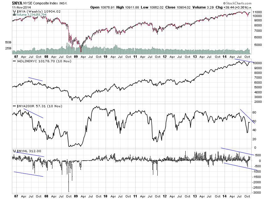
This index is actually one of the few that has failed to make new highs during the ramp over the past few weeks. Still, it’s plain to see that the cumulative advance-decline line (top black line), the percent of stocks trading above their 200-dmas (middle black line) and the pattern of new highs-new lows (bottom black bars) are all diverging from the new highs being made by the major indexes. The last time all three of these internal indicators diverged this way was in October of 2007, just prior to the bear market that coincided with the financial crisis.
The Nasdaq Composite looks very similar:
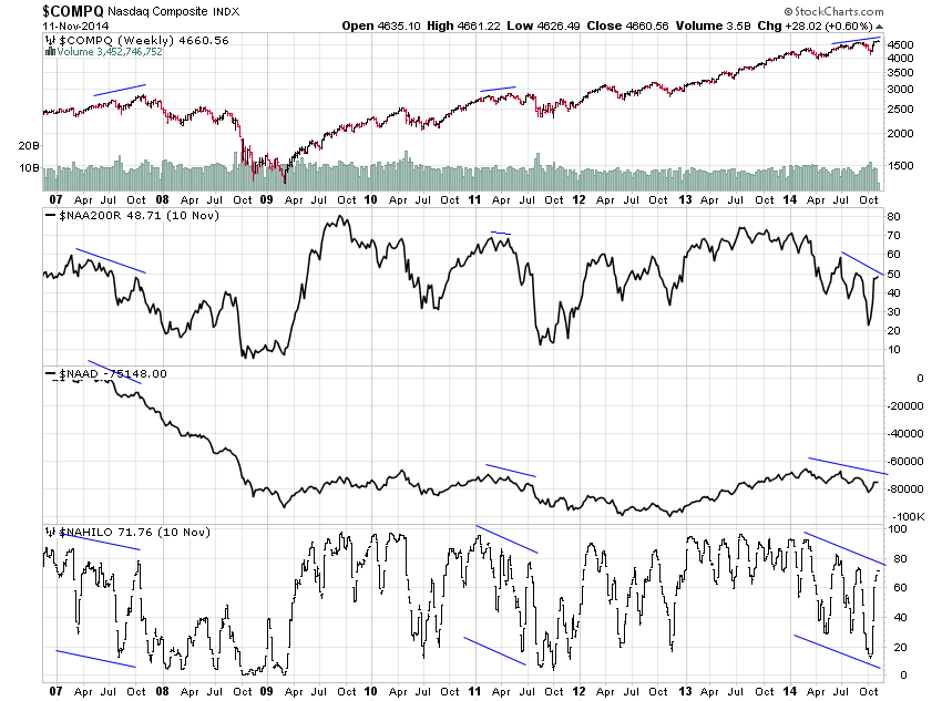
The main difference here is that the three indicators diverged not just in 2007 but also in 2011 prior to the selloff precipitated by the European sovereign debt crisis. Overall, I think it’s safe to say the current uptrend is not as healthy as the bulls would like to see. And both of these composite indexes are important components of the S&P 500 index so don’t think it’s immune.
Still, it’s true that prices for both of these indexes have regained their 200-day moving averages and multi-year uptrend lines. Ultimately, this tells me that the overall uptrend is still in tact. But these internal diverging indicators suggest that it may be nearing its end as more and more of the underlying components have, in fact, given up their own uptrends.
What’s more, considering the extreme levels of overvaluation and bullish sentiment, the next cycle lower, when it does finally turn, may be more than just your average market correction.