9-30-16
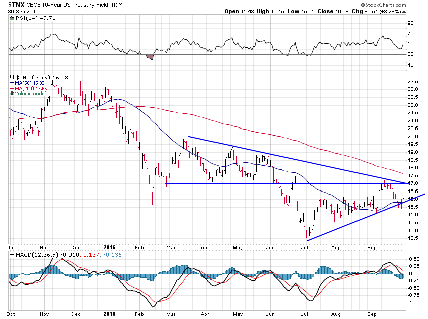
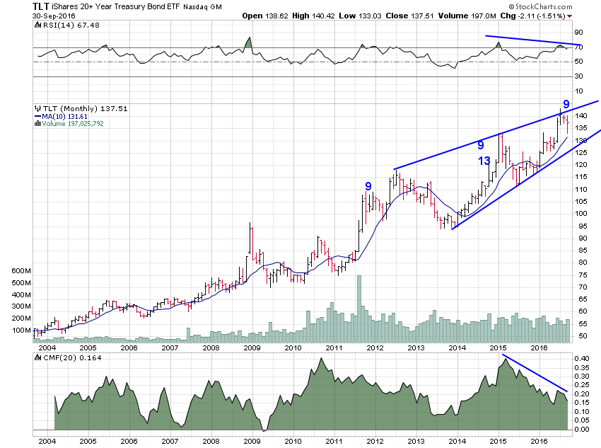
Taking a look at the bond market, earlier in the week it looked like the 10-year treasury yield was going to break down. Today, it reversed course and regained its uptrend line.
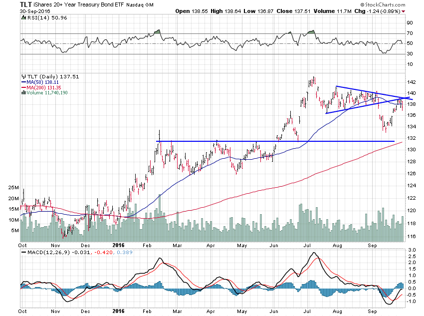
The TLT chart looks like a pretty clear breakdown out of a pennant with the ETF more recently rising to test the breakdown before reversing again today. The bottom line is there is a clear pattern of lower highs and lower lows on the chart now.
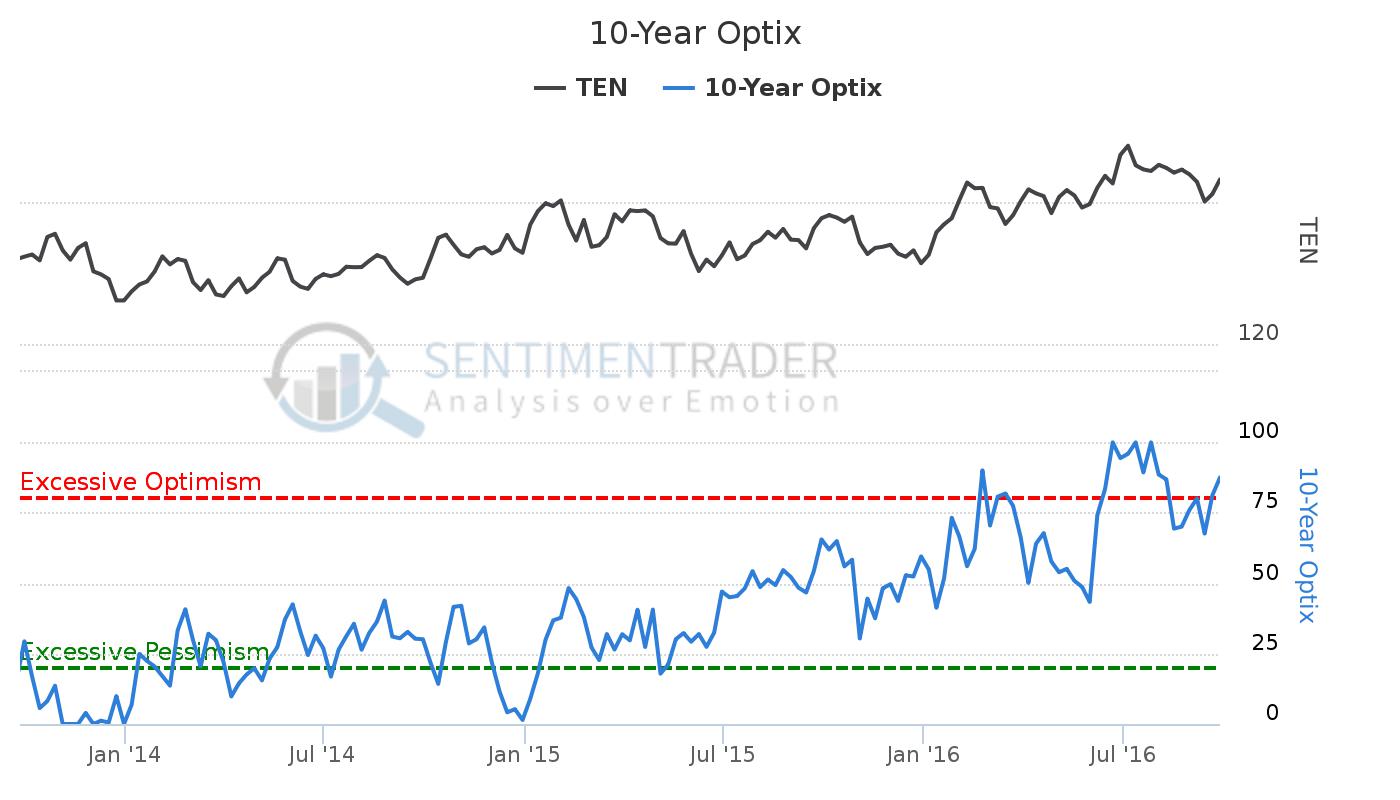
What I find surprising is that sentiment has remained so bullish in spite of this clear downtrend.
Another interesting sentiment signal came after I tweeted the chart/article below. After doing so I received a number of responses claiming inflation was impossible so long as the economy remained subdued. I guess they’ve never heard of stagflation. Normally, when I receive a lot of pushback to an idea like this it’s a decent sign that the idea has hit a nerve. We’ll see.
Market-based inflation expectations hit 14-month high https://t.co/3GcMfpEQAa pic.twitter.com/ZKL2PelTmC
— Jesse Felder (@jessefelder) September 28, 2016
I’m pretty certain that these bullish traders aren’t looking at the longer-term signals in TLT. Those divergences along with the DeMark sell signals suggest to me that longer-term bonds have likely hit, at minimum, an intermediate-term peak if not the final bull market exhaustion.
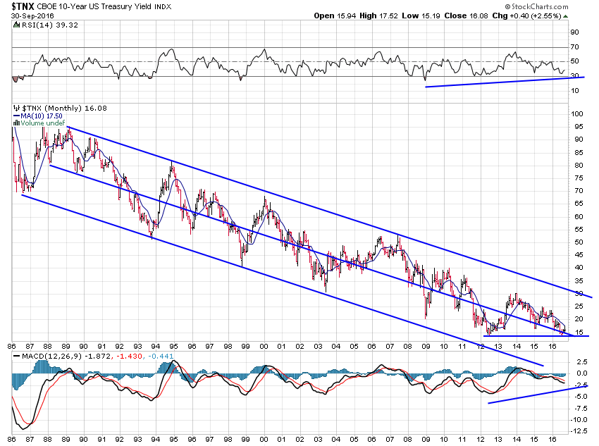
And on the longer-term chart of the 10-year yield it still looks like it is trying to form a double bottom.
9-29-16
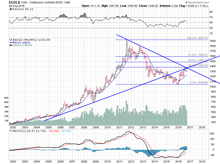
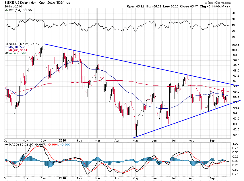
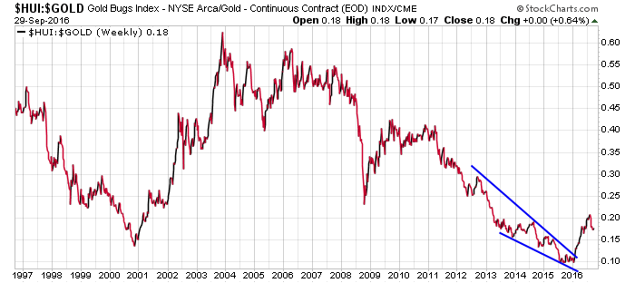
Last week I promised I’d look at gold and the mining stocks I own. For now, the precious metal still remains below significant resistance indicated by the crossing of both the downtrend and uptrend lines on the chart. These also intersect right near the 38.2% Fibonacci retracement. As I’ve written before, I think it will take a major catalyst to break above all of this.
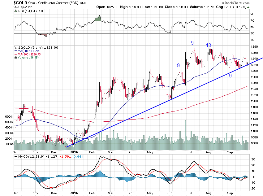
On the daily chart, gold has fallen back this week to test its uptrend line before managing a pretty poor rally attempt today. A break of the uptrend line could usher in some decent selling. It looks to be on about bar number 8 of a potential 13 DeMark Sequential buy signal here so a good week or two of selling ought to trigger it.
If the dollar even just trades up to test that downtrend line in the chart below gold probably breaks down. And with what’s going on with the European banks (not to mention Saudi banks) I wouldn’t be surprised at all to see some strength in the greenback going forward.
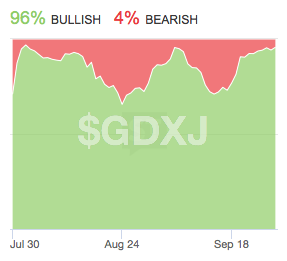
It’s really the junior gold miners, though, that I’m watching as a proxy for gold sentiment. This ETF has already broken its uptrend line and formed a pretty clear head and shoulders top pattern.
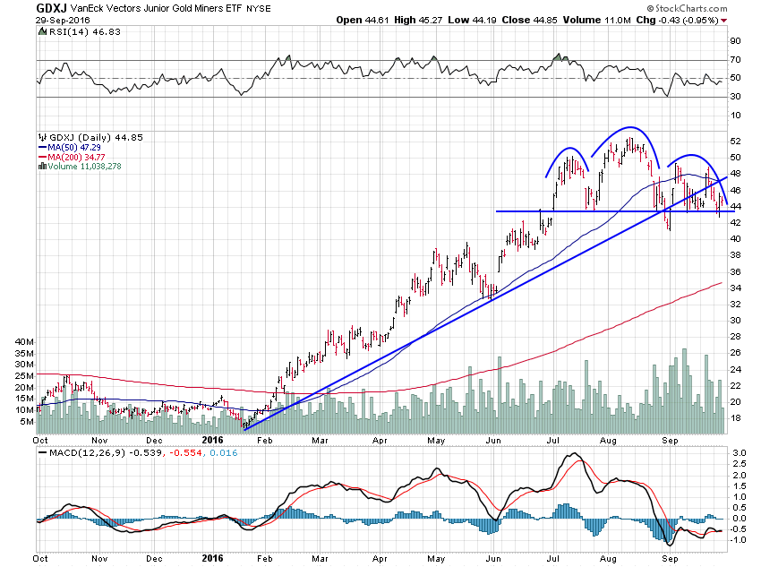
Despite this bearish-looking technical setup StockTwits traders have become super-bullish toward the ETF. I’d much prefer to see some bearish sentiment here, or at least some reduced bullishness, before becoming more constructive toward the group in the near term. Maybe if that head and shoulders top pattern plays out we will finally see some of these bulls throw in the towel and offer us an attractive opportunity to add exposure.
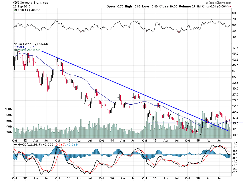
Goldcorp has managed to hold up above its horizontal support area during this corrective phase. Should gold breakdown, however, it may not be able to keep its chin up like this. This is one of the cheaper stocks in the group and insiders are still buying so any further weakness will likely offer a good buying opportunity.
NewGold has not been able to hold support and has also broken its uptrend line. There is another support area below around $3.50. That’s also the 61.8% Fibonacci retracement level. If we ever get there it will also be a good place to back up the truck and load up. For now, though, I’m just trying to stay patient and wait for a high-probability setup. We may get one; we may not.
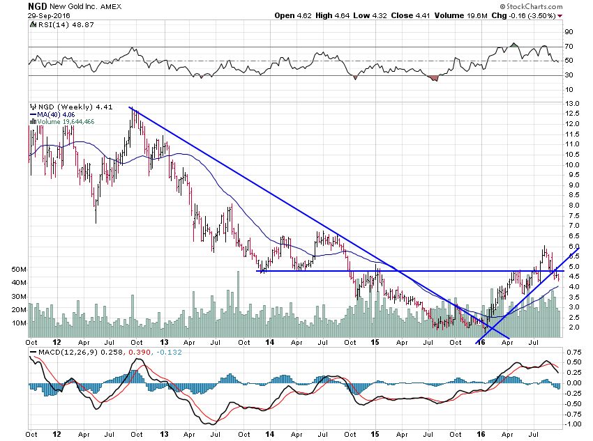
I’ll maintain a position in both either way as the long-term prospects for the metal could hardly be brighter. And when gold finally does break higher the miners will have a massive amount of upside. Just take a gander at how cheap they still are relative to the metal and you’ll have some idea of what I mean.
9-27-16
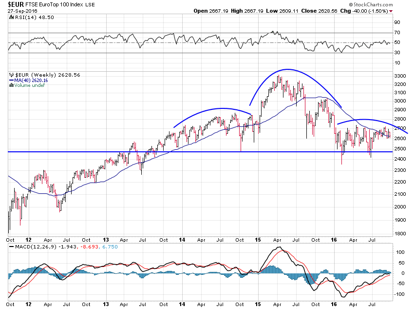
Yesterday we looked at our stock market here in the U.S. Today, I want to look abroad again. The reason I like to do this is that these large developed stock markets cycle in concert with each other. That becomes pretty obvious when you look at the chart below.
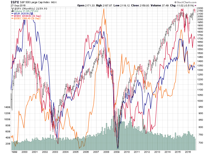
Recently, the divergence between the U.S. and the rest of the world has been incredible. While these other markets are clearly mired in bear trends, ours has risen to new highs. I consider this a negative inter-market divergence similar to that seen in the Dow Industrials versus the Transports or the S&P 500 versus the Russell 2000 right now. Strong markets rally together. Weak markets are accompanied by these sorts of divergences and this is a massive divergence.
Some might argue that, rather than offering a bearish inference, maybe these foreign markets are ready to catch up to the upside. Take a look at the EuroTop 100 chart below and ask yourself if this looks like a chart ready to explode to the upside. To me, it’s just forming a massive head and shoulders top pattern that, once completed, projects a test of the 2011 crisis lows if not the 2009 lows.
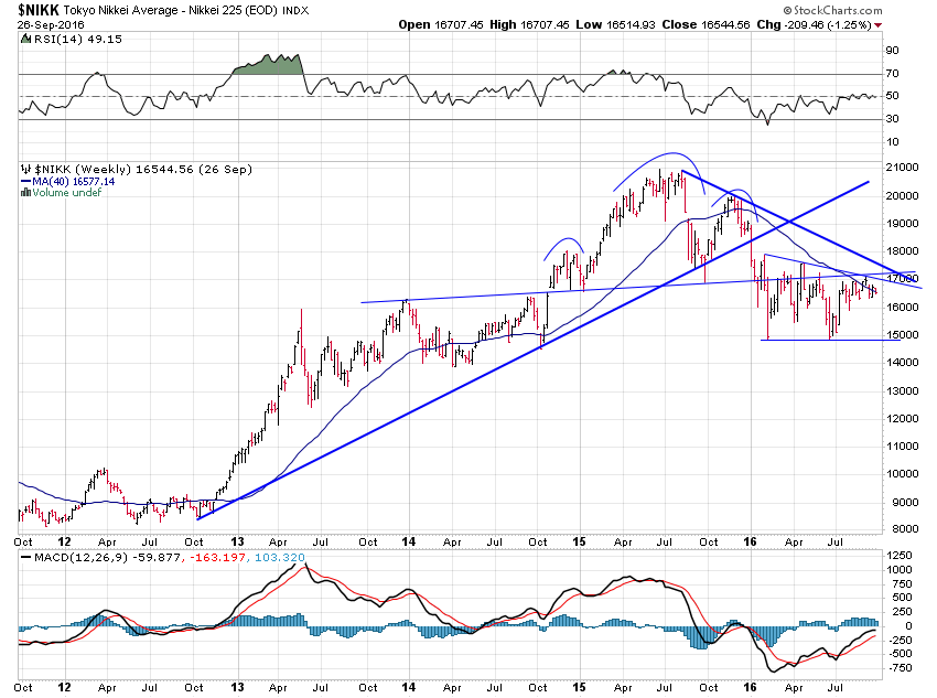
Japan really doesn’t look any better.
But the one to watch here is China. I know most people still consider this an “emerging market” but because it is the second largest economy on the planet I have to include it in this group. And of the group, it has the most bearish chart. This is a textbook head and shoulders top pattern that completed earlier this year when it broke the neckline after completing its right shoulder. Believe it or not, it projects all the way down to its 2005 lows (not pictured) around 1,000.
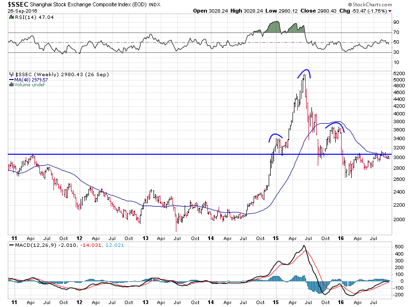
I know that sounds like a very dire forecast but that’s just what the technicals tell me. And when you consider the fundamentals, it doesn’t sound so far-fetched.
The credit-to-GDP gap is the best single early warning indicator of financial crisis: https://t.co/31jSKuPpBg pic.twitter.com/bSqA1Aj5hd
— Jesse Felder (@jessefelder) September 27, 2016
So when I weigh the balance of the evidence I have to believe these global market down cycles will eventually pull the U.S. markets down with them.
9-26-16
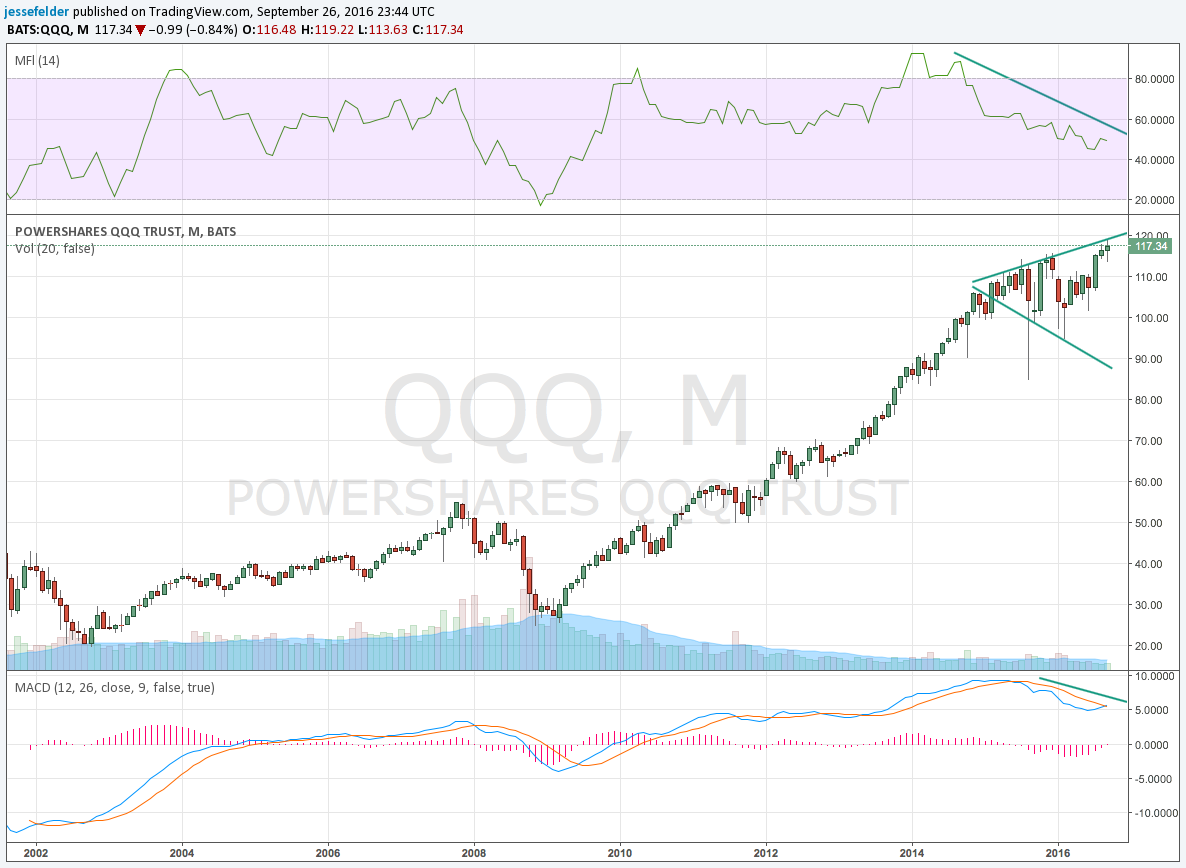
The past two days’ worth of selling has seen the Nasdaq 100 give back its recent breakout to new highs. You’ll notice the recent gains were not accompanied by impressive money flow or momentum (MACD) which is probably why it was unable to hold those highs. This now looks like a small broadening top pattern.
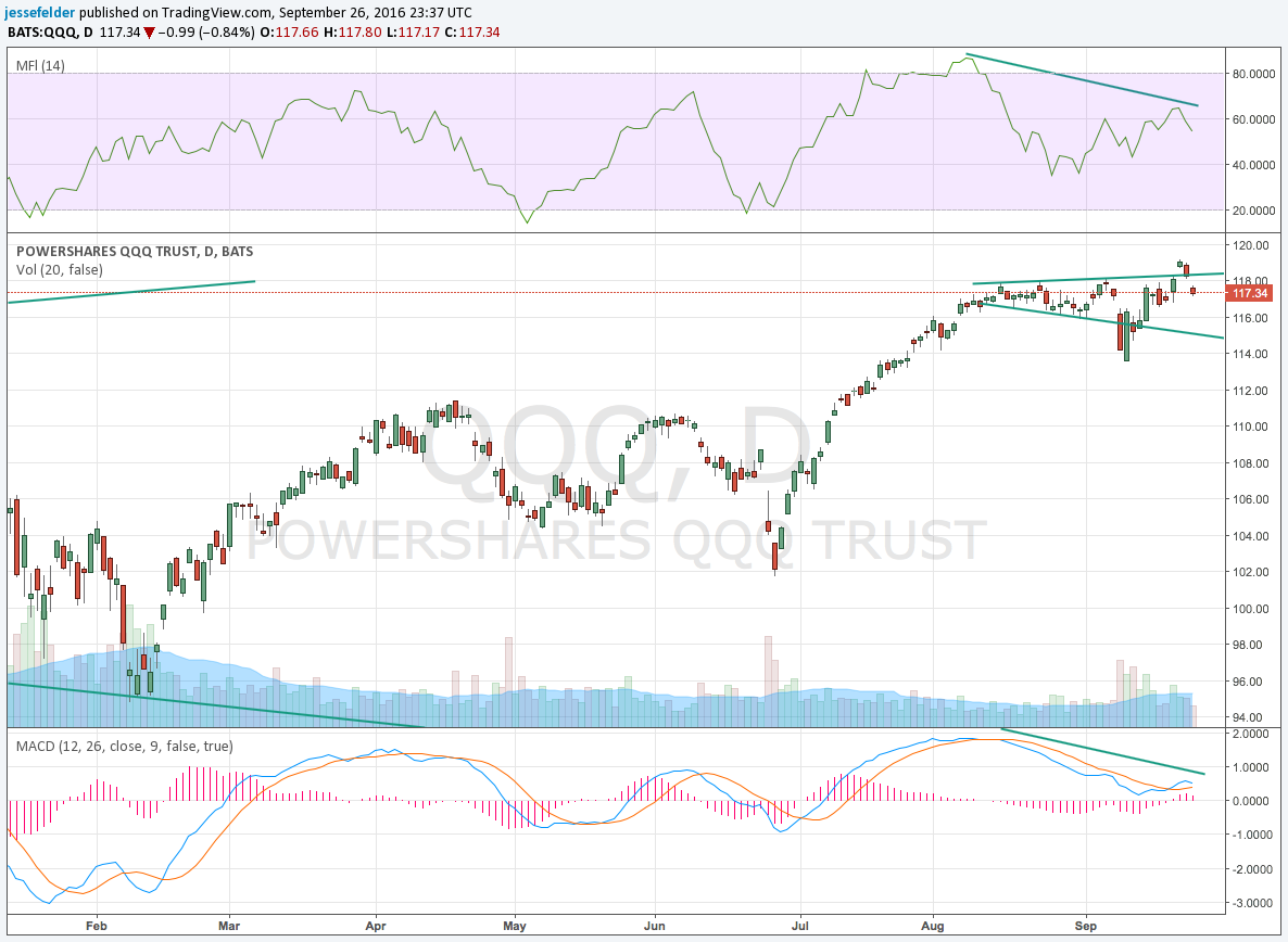
And it comes amid a larger broadening top pattern with very similar divergences on a monthly time frame.
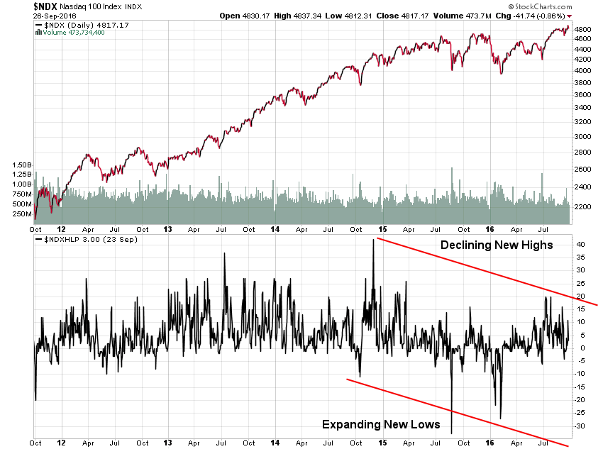
Breadth is also very poor in both the short-term…
…and on a longer-term time frame.
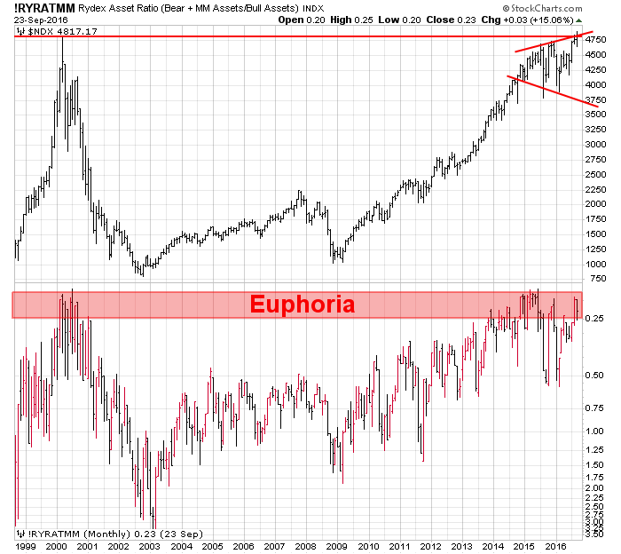
This topping behavior comes amid history rhyming in terms of euphoria among Rydex traders.
I’m so focused on the Nasdaq right now because, as I wrote in last week’s chart book, it’s really just the tech sector that’s held the broader market up lately. If it fails, the major stock market indexes could really begin to reverse course to the downside again. The potential pattern I’m looking for here is this “three peaks and a domed house” one David Larew has been tracking in the S&P 500.
3 peaks and a Domed House – back in the Volume Void and under huge resistance if futures hold up. Last Gasp up with the Fed last week pic.twitter.com/TqNXpNDTGy
— David Larew (@ThinkTankCharts) September 26, 2016
Also of interest are these chart patterns that were shared with me over the weekend. There are some eerie similarities between the recent market action and that we saw just prior to the two most famous crashes in history. Now, I have written recently that the various short volatility trades in the market make it more susceptible to a crash. That said, a crash is a very, very rare phenomenon. Even if the probability of a crash is higher than usual it’s still a low-probability event.
@jessefelder #GameOverGlobal
WALL STREET: "THE HUNT FOR RED OCTOBER"….! pic.twitter.com/Sy7E8ugjQd— jorge compagnucci (@compa1968) September 25, 2016
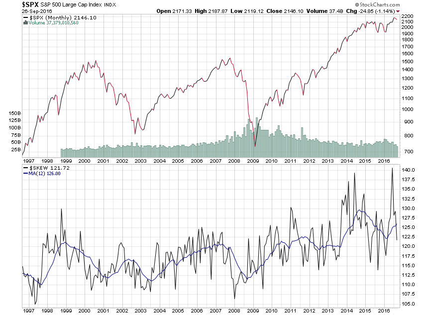
The SKEW indicator was created precisely for this reason. It shows the probability of a crash as priced by the options market. According to this one measure, the risk of a crash is now the highest it has ever been since its inception in 1990. Investors ought to take a page out of the Boy Scout handbook and “be prepared.”