For the past couple of years “The Scariest Jobs Chart Ever,” has been frightening traders every month it’s been updated. Below is today’s update:

It’s important to note that the chart was actually created by Calculated Risk, a fantastic blog focused on finance and economic data. They didn’t, however, give its famous moniker. It was dubbed “The Scariest Jobs Chart Ever” by Business Insider who, through the sensationalized headline and power of their following, is probably responsible for its popularity.
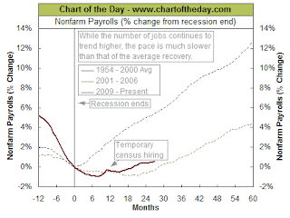
Another interesting fact to note is that this chart marks the percent of job losses since the start of the recession. Indeed, we lost a huge number of jobs during the “Great Recession.” But if we look at the percentage change in the number of jobs since the end of the recession, as ChartoftheDay.com does today, it tells is slightly different story:
In fact, while it’s still historically weak, job growth over the past two years has been better than the recovery after the prior recession (2001). And from the looks of it, I would wager it’s been better than the post-recession period prior to that one, as well (1990).
This doesn’t change the fact that the “Great Recession” was a jobs killer like few the country’s ever seen but, to be fair, job growth since then has been, relative to recent history, pretty damn good. But that won’t help Business Insider boost their pageviews so don’t expect to hear it from them.