…or “A Tale of Two Charts, Part Deux”
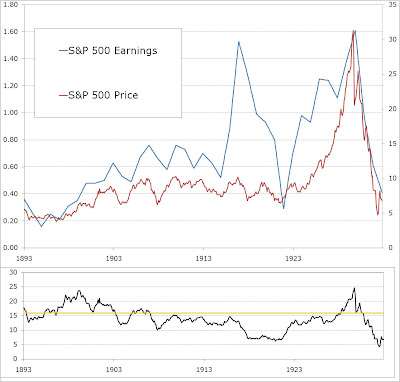
Here are a couple of other charts I’ve been working on that I find pretty fascinating. First, is the S&P 500 earnings and price for the 40 years ending in 1932, the crash the precipitated the Great Depression:

From 1929 to 1932 earnings declined 75% and the stock market crash resulted in a price-to-earnings ratio, shown beneath, of 5 (two standard deviations below the historical average for the index).
This next chart shows the earnings decline from 2007 to today:

Earnings declined over 90% during this time, even more dramatic than the 1929 crash! However, stocks have held up much better than the 1929 crash. In fact, rather than becoming dramatically undervalued, stocks are right back to overvalued on a level nearly equal to the 1972 and 1987 peaks!!