The following chart first came out a few years ago but was just recently updated. It shows the past 100 years+ history of the Dow Jones Industrial Average and price-to-earnings ratio for the S&P 500. IMHO, it’s the most important chart of the Millenium:
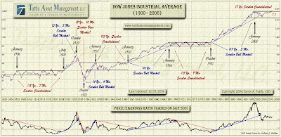
Anyone for another 10 years of “consolidation?” (Props to Kevin Tuttle and TAM.)
LIV