Everyone knows that the stock market has been roughly cut in half over the past 18 months or so. We’re basically seeing a 50% off sale in stocks right now but how do we know if they are really cheap?
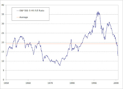
Let’s take a look at the numbers. The chart below plots the S&P 500 Index’s price-to-earnings ratio over the past 50 years with its average over that time. (I like to use an average of the trailing 5 years’ earnings to reduce the noise level – ala, John Hussman).

As the chart shows, this is the cheapest p/e we’ve seen in over 20 years. Not since the early 1980’s have stocks been this cheap relative to their earnings.
This next chart looks again at earnings but in a different way. The “Fed Model” is a tool compares the earnings yield of stocks to the yield on the Long Bond to determine their relative attractiveness (again, I use 5-year trailing earnings, rather than forward earnings, divided by the yield on the Long Bond).

The chart above shows the ratio of the S&P 500’s actual price level divided by the Fed Model’s hypothetical valuation. At no time during the past 50 years have stocks been this attractive using this measure.
The next chart again uses the Long Bond to determine the relative cheapness of stocks. It uses the S&P 500 dividends, however, rather than earnings. Like the previous chart, it shows that stocks haven’t been this cheap relative to the Long Bond in at least 50 years.

The bottom line is stocks are cheap – and not just cheap – they are cheapest we’ve seen for decades. Maybe this is why the most successful investor in the history of the world has decided to go “all in.”
Source data:
Online Data Robert Shiller
http://aida.econ.yale.edu/~shiller/data.htm