The following is an excerpt from a recent report featured on The Felder Report PREMIUM.
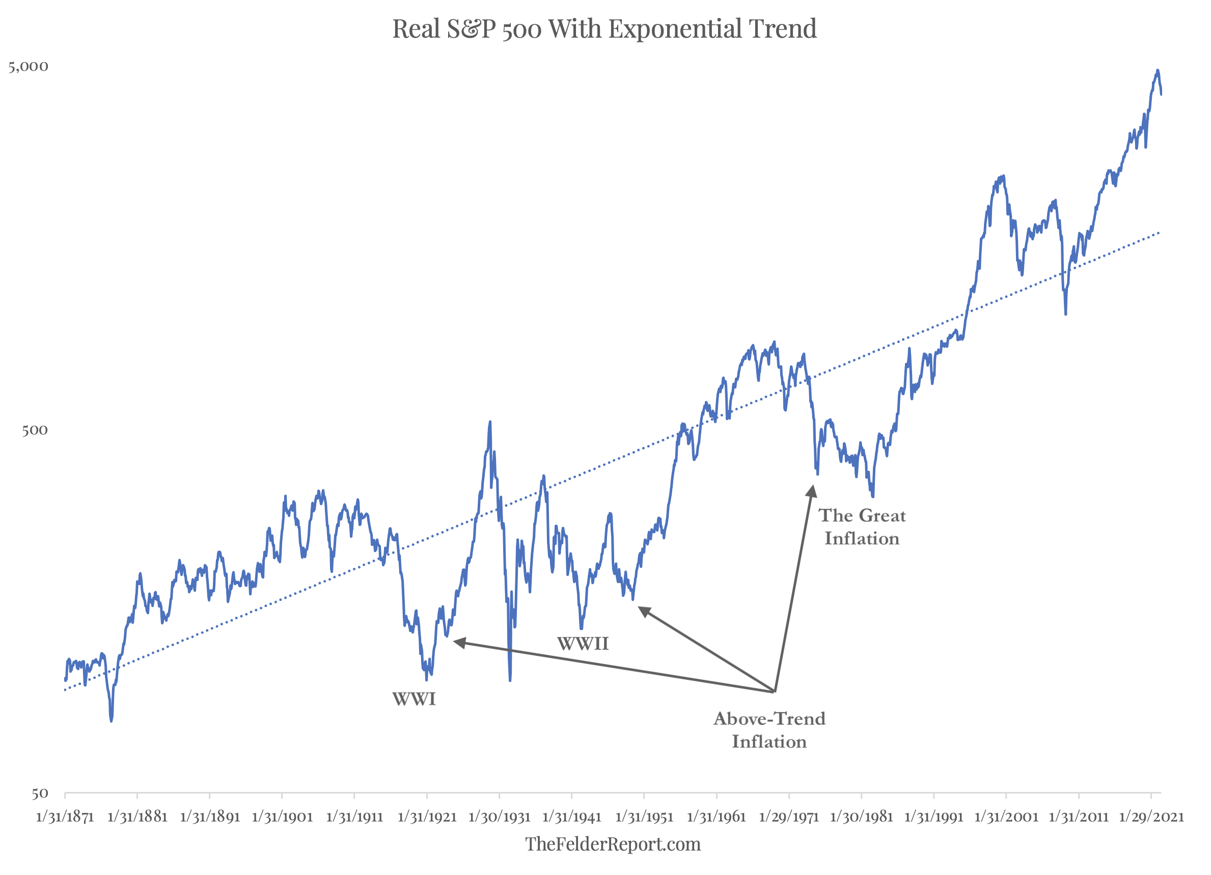
The weakness in the stock market so far this year has many pundits and investors alike wondering if we might be closer to the end of the drawdown than the beginning. From the indicators I watch, it is fairly obvious that we are still in the very early days of the process. Either way, ‘how much further can stocks fall?’ is now the $64,000 question (or, given the inflation rate since that game show last aired, I should probably say $640,000 question). To answer it we might simply look at the trend in inflation-adjusted stock prices over the past 150 years (courtesy of Robert Shiller). The first thing that jumps out from this chart is the fact that stock prices, even after this year’s decline, have never been more elevated relative to their long-term trend than they are today. Thus the potential for reversion back to trend is more significant than at any prior major peak in history.

But there is another feature of the chart I would point out that requires a few annotations. The periods in which stocks spent a prolonged period of their time below trend were marked by elevated inflation. World War I, from 1914-1918, represents the first of these and World War II, from 1939-1945 represents the second; The Great Inflation of the 1970’s marks the third. If we are now in the early stages of another prolonged period of inflation, then it only stands to reason that stocks could once again fall not only back to their long-term trend but well below it. Considering the fact that a simple reversion to trend, if it happened tomorrow, would require the S&P 500 Index to fall back below 2,000, the prospect of an even greater decline is a frightening one, indeed.