
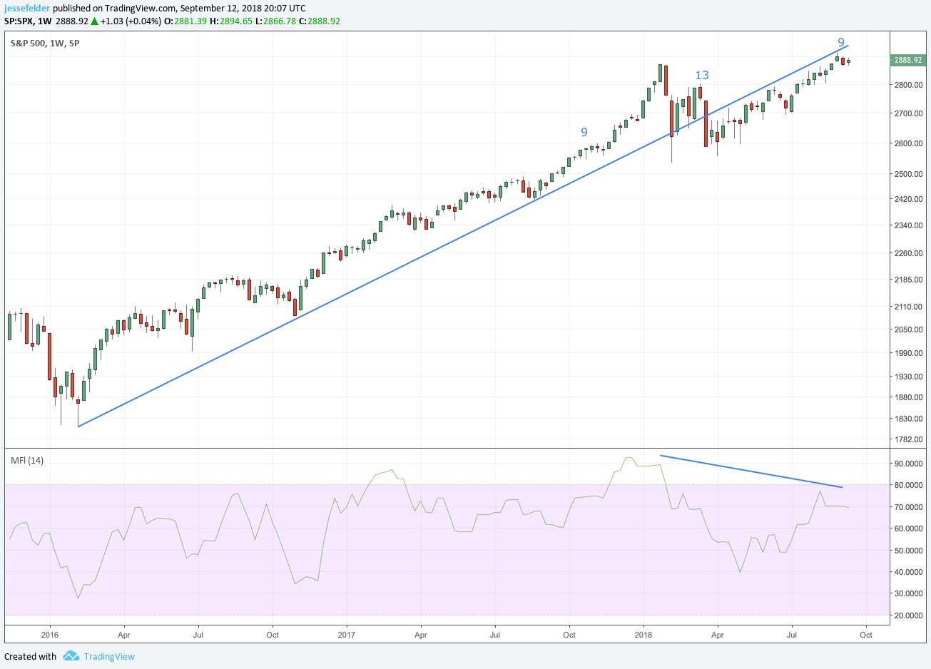
Last week the S&P 500 completed a weekly 9-13-9 DeMark Sequential sell signal. This comes as it tests the underside of the broken uptrend line that dates back to the early-2016 low. Bearish divergences in money flow and momentum (not pictured) also confirm the bearish message from the DeMark sell signal.
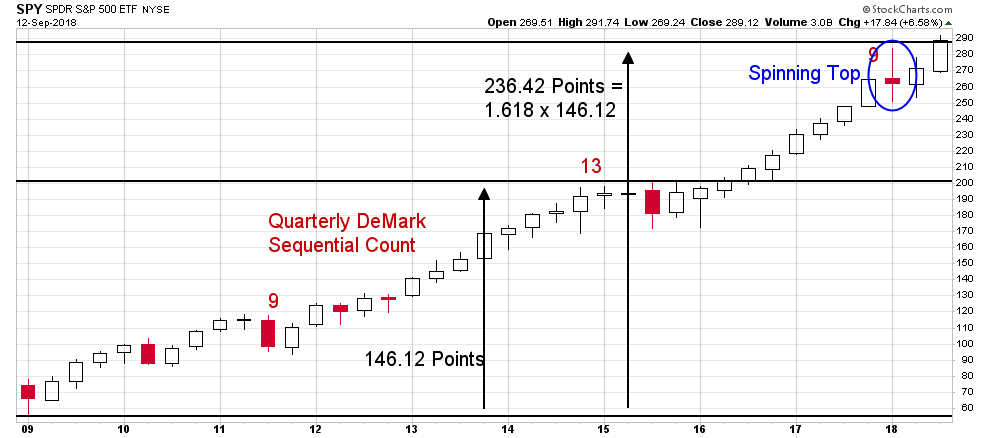
These shorter-term sell signals are lining up with the longer-term ones that have been in place since late last year. A quarterly 9-13-9 DeMark Sequential sell signal triggered during the fourth quarter last year just as the S&P 500 ETF was tagging the 1.618 Fibonacci extension of its bull market gains from 2009 to 2014 (which lines up almost perfectly with the DeMark risk level from that sell signal). But there are other warning signs piling up that are much more significant than these few technical signals.
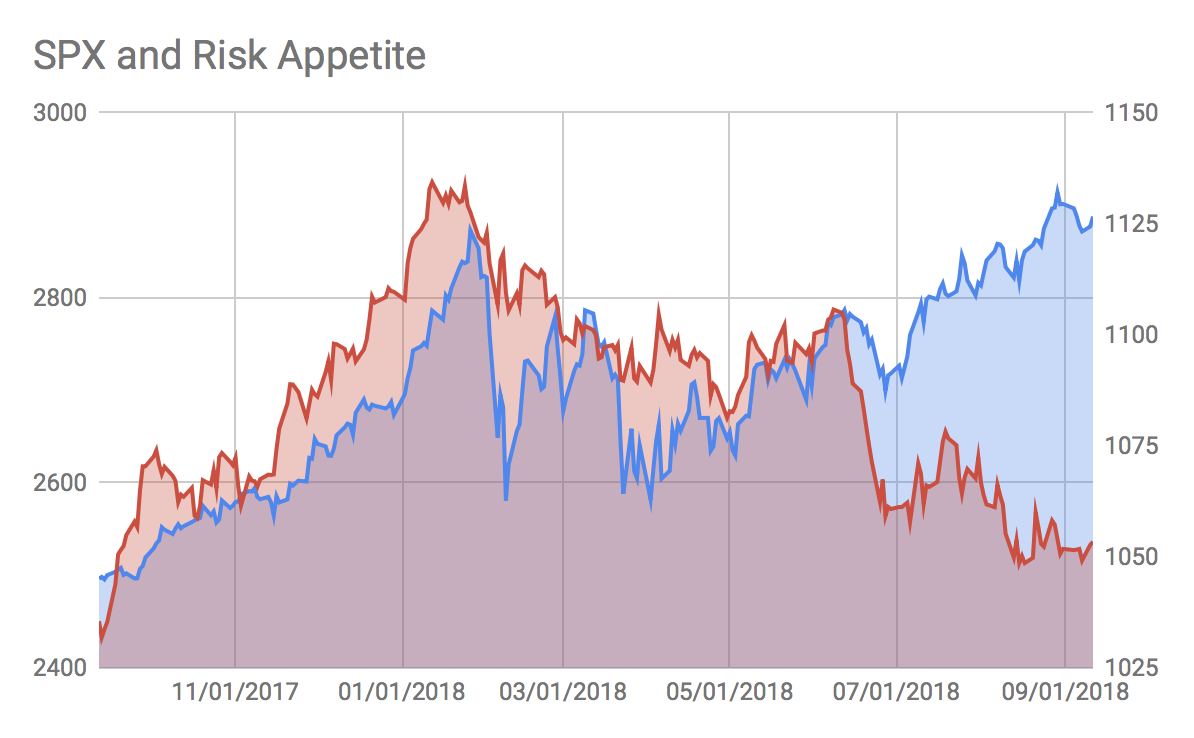
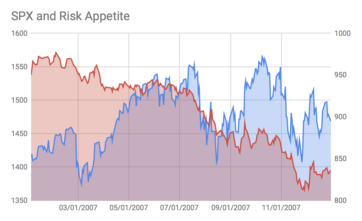
In a follow up to the recent chart book discussing risk appetites I went to some lengths to put together a risk appetite index. It is mainly the product of the relative returns of cyclical versus defensive sectors along with spreads in corporate bonds. The theory behind it is that when investors prefer cyclicals over defensives and corporate bonds over treasuries it should be beneficial to risk assets in general and vice versa.
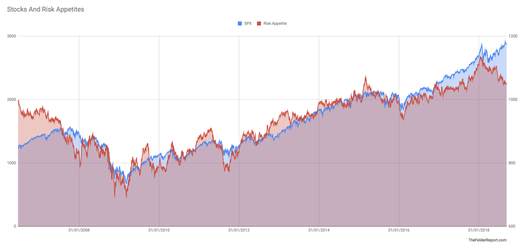
Currently, rising stock prices are not being confirmed by rising risk appetites. In fact, the divergence here is the greatest we have seen since the 2007 market peak. This is not the sign of a healthy uptrend. Just the opposite. Investors are already turning defensive across most sectors and asset classes even if this shift is being masked by strength in the index.
Perhaps even more troublesome for the stock market is the massive deterioration in breadth that is also occurring under the surface. Over the past ten days we have seen a total of 11 Hindenburg Omens triggered across the NYSE and the Nasdaq. This matches the total from late-2014 that eventually led to the steep selloff in August of 2015. It surpasses the totals seen in November of last year, prior to the January sell off, and at the 2007 and 2000 peaks.
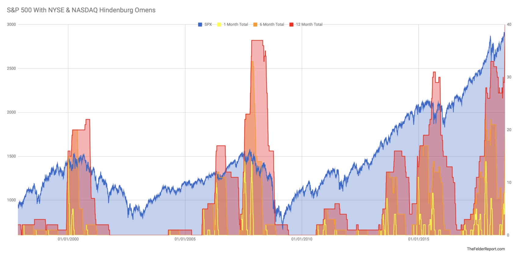
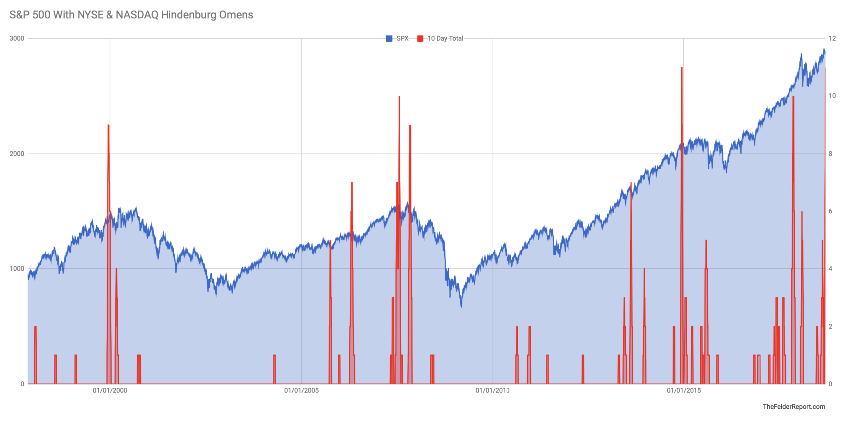 And over the past 12 months we have now seen a total of 40 Hindenburg Omens across the NYSE and the Nasdaq. This is the most in over two decades of data that I have looked at. It’s true there are not many prior occurrences to go by but in the past when we have seen anything close to this number it has preceded at least a 15% selloff (as in early-2016) if not a full-fledged bear market (as in 2001-2002 and 2008).
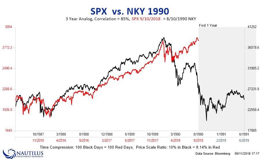
The combination of shifting risk appetites along with deteriorating breadth amid multiple technical sell signal across multiple time frames confirms the idea that we are in the midst of another major topping process and that the beginning of a new bear market could be imminent. There are still a pair of price analogs I’m watching in this regard. First is the 1990 Nikkei peak. This analog failed over the past few months but looks like it may have started working again over the past few weeks.
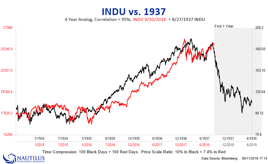
Next is the 1937 price analog that I discussed recently. This one is especially relevant due to the fundamental parallels between then and now.
All of these things taken together make a very good case that the current equity market environment is among the most dangerous we have ever seen. As a result, investors should adopt the most defensive posture their discipline will allow.