
In my experience, major stock market peaks are accompanied by extreme valuations, euphoric sentiment as indicated by the liberal use of leverage (and derivatives), deteriorating breadth and long-term technical exhaustion signals. Today, every one of these components is now in place. When looking at valuations, I prefer my friend John Hussman’s market cap-to-gross value added metric. It’s essentially a price-to-sales measure for the broad stock market and an improvement upon the famous Buffett yardstick, market cap-to-GDP, which doesn’t include foreign revenues earned by domestic business. This measure recently hit a new all-time high, surpassing that set during the peak of the dotcom mania.
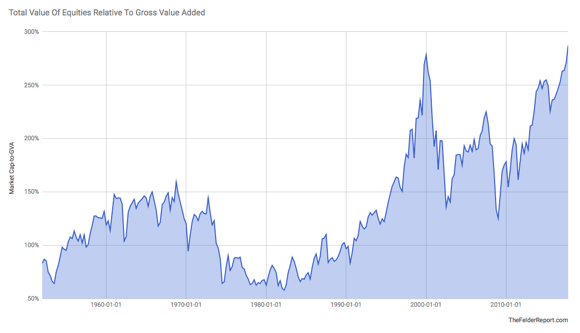
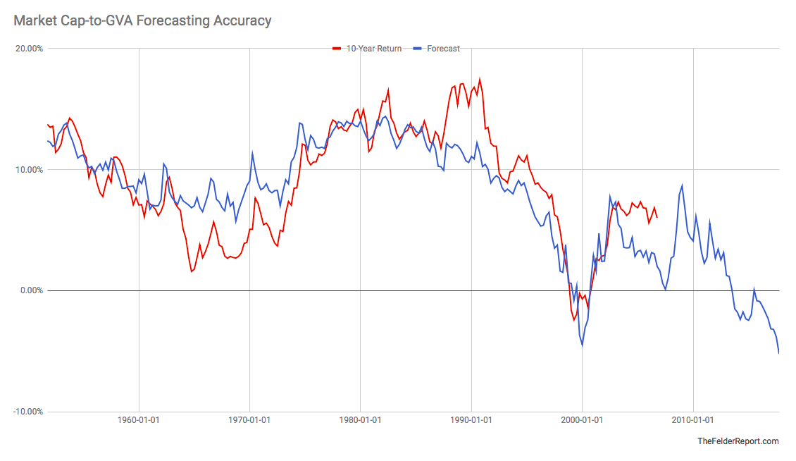
What makes this measure so valuable that it has a very high negative correlation with future returns. In this way, it may be the best demonstration of the famous Buffett adage, “the price you pay determines your rate of return.” Pay a low price and get and high return and vice versa. Today, stocks currently offer a negative total return over the coming decade just as they did the last time they got near these valuation heights.
Turning to sentiment, I like to give more weight to measures that track investor positioning rather than sentiment surveys. I want to know what investors are actually doing rather than what they say they’re doing. To me, the level of margin debt shows the potential supply and demand for risk assets. When margin debt is low there is plenty of potential demand and when it’s high there is plenty of potential supply. Nominal margin debt recently surpassed $600 billion dollars for the first time on record, roughly twice the amount seen at the peak of the dotcom mania.
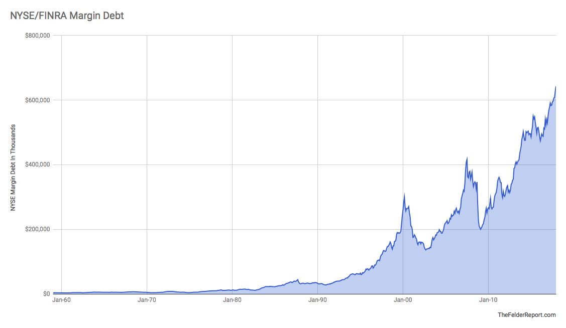
Even when you normalize it by comparing margin debt to the overall size of the economy, margin debt has recently broken out to new highs. Notice in the chart below that for a long period of time, several decades in fact, investors were content to speculate in a leveraged manner to a very minimal degree. Even the 1987 margin debt peak in the chart below is just a ripple compared to the surge seen during the dotcom mania. There may be no better representation of the moral hazard created by interventionist monetary policy than the chart below. Ever since the “Greenspan put” came into existence just after the 1987 crash investors have embraced risk taking like never before and today’s it’s reached a new extreme.
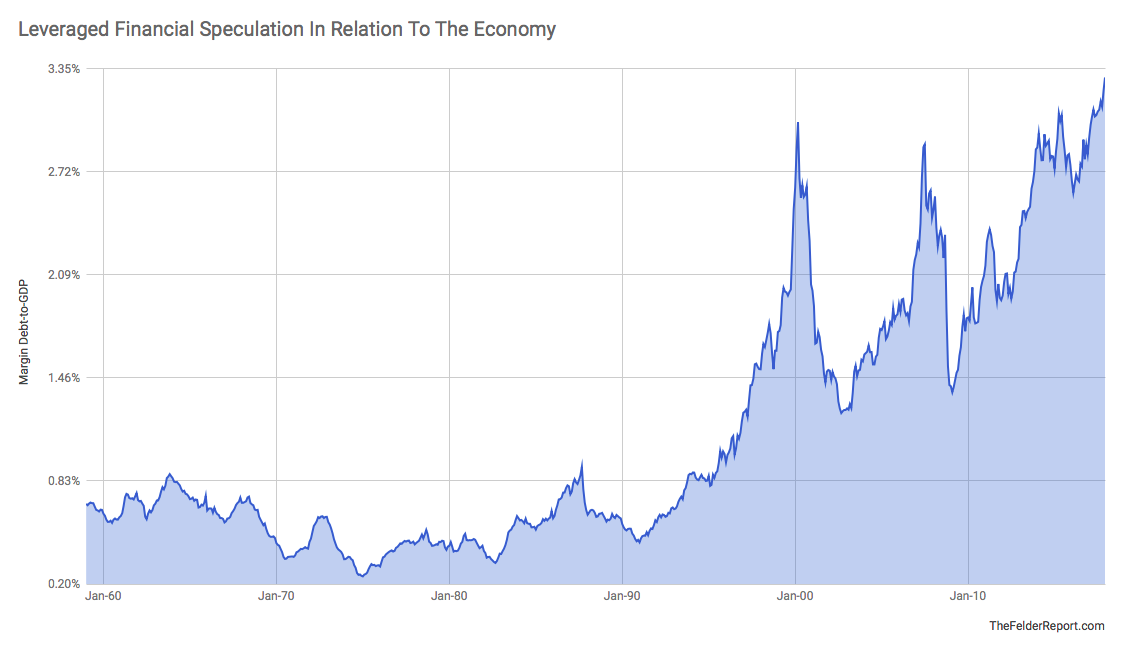
An interesting feature of margin debt relative to GDP is that since margin debt has grown so much in relation to the economy, starting in the mid-1990’s or so, there has arisen an interesting negative correlation between the ratio and forward 3-year returns in stocks. For a long period of time, when margin debt was minimal in relation to the size of the economy, there was really no relationship between the two. But since the dotcom mania when margin debt has surged to represent roughly 3% of GDP it has regularly led to 50% drawdowns in short order. Margin debt reached this level in 2015 and, while it looked like stocks might embark on another major drawdown in early-2016, they reversed and relationship has yet to be reasserted. Still, the idea that the amount of forced liquidation can be a factor in the magnitude of a bear market makes intuitive sense and, at least over the past half century, we have never seen what this amount of margin debt, being unwound, is capable of producing in terms of downside risk.

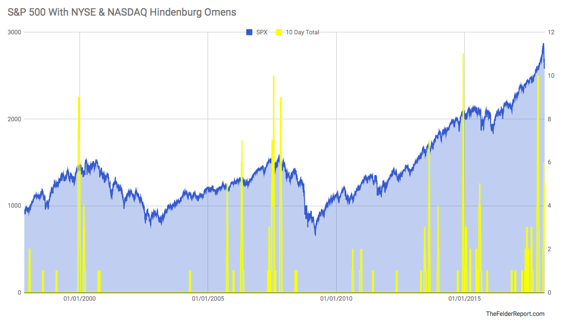
Turning to breadth, what we’re really looking for for signs of a major market peak is evidence of increasing dispersion. Late-cycle bull markets that enter a topping process are driven by fewer and fewer leaders as more stocks fall to the wayside. This winnowing eventually results in a major reversal. The Hindenburg Omen was famously created as a crash indicator but I have found that it’s really more effective in identifying just the sort of dispersion that is the hallmark of a tired bull market ripe for reversal. Late last year we saw a 10-day trading window where the NYSE and Nasdaq saw a total of 10 Hindenburg Omens. This is similar to what we saw in late-2014 prior to the 2015 yuan devaluation mini-crash and in mid-2007 before that. It’s also a greater number of omens than we saw in late-1999, just a couple of months before the dotcom mania peaked.
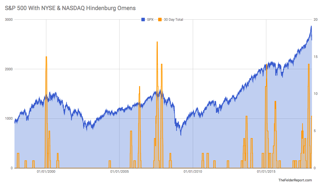
Using a 30-day trading window we can see that the late-2017 cluster was once again similar to those prior peaks and we even had an “echo cluster” in late-January (in both the 10-day and 10-day totals) similar to those seen in March of 2000 and the fall of 2007.
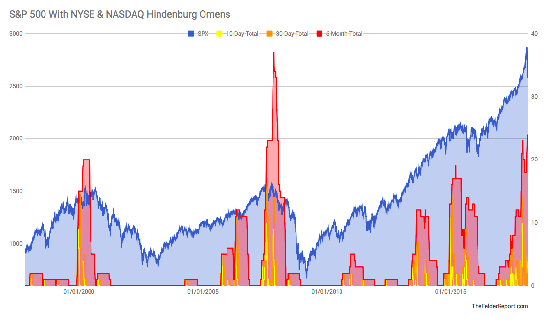
A 6-month trading window shows a cluster that now surpasses the dotcom mania’s cluster and is second only to the late-2007 peak which preceded one of the most swift and painful bear markets on record.

Put them all together and it’s pretty clear that when these “flames” jump all together the stock market is vulnerable to a major shift in trend. This suggests the recent reversal in stocks is very likely more than just your garden variety correction. Because it is accompanied by a significant amount of breadth dispersion as indicated by a large cluster of Hindenburg Omens on multiple times frames and across both major exchanges the odds are high that another major bear market could be imminent, if it hasn’t begun already.
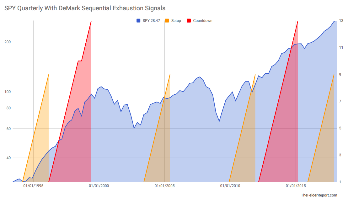
Finally, we can look for long-term signs of technical exhaustion. Here, I prefer to use the DeMark Sequential Indicator as this is its primary purpose and, at least in my experience, has a good track record of identifying potential points of trend exhaustion. On a monthly time frame the S&P 500 recently triggered a sell signal a couple of months ago. Normally, these signals would be represented by annotating a “13” on the chart. In the chart below, I’ve simply shown a rising red area. When it reaches the 13 level on the chart a sell signal is triggered. You’ll notice the last sell signal was triggered just as our Hindenburg flames rose to worrisome levels, as well, in late-2014. Prior to that we had a completed 9-13-9 sell signal in mid-2007 and a 13 sell signal before that on this time frame back in 1999, a few months prior to the dotcom mania peak.
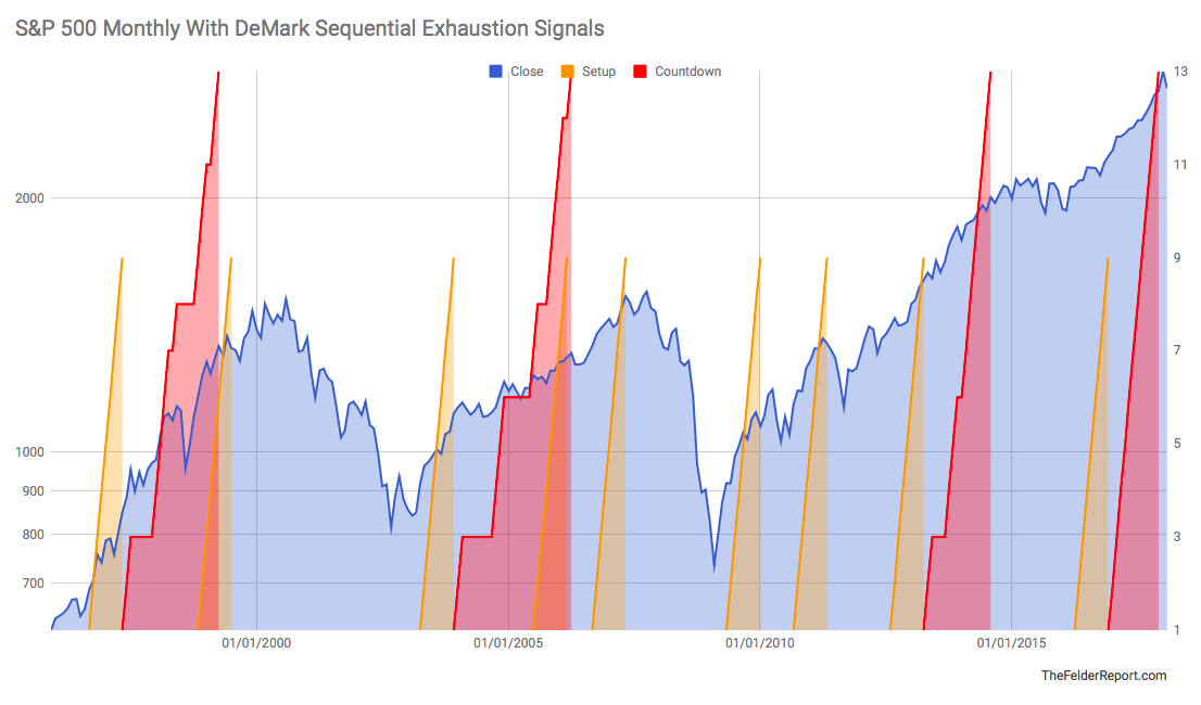
On an even longer-term time frame, the SPY ETF recently completed a 9-13-9 sell signal on the quarterly chart. Prior to this we did not get a sell signal on this time frame ahead of the 2007 peak but we did have one again in 1999 before the dotcom mania peak. Taken together, the sell signals on both the monthly and quarterly charts suggest that the current bull market could already be exhausted.
Putting it all together, extreme valuations and record leverage being employed by investors both point to a steep drawdown once the next bear market commences. The amount of forced liquidation could be massive and fundamental investors are not likely to step in until valuations become far more attractive and that means much lower prices. Even then, because their firepower has been severely diminished, any buying they may do would be easily overwhelmed should passive investors eventually embrace active panic (as investors inevitably do in a bear market). Add the fact that winnowing leadership and technical exhaustion across multiple time frames suggests a high probability that a major reversal is in the cards and it’s not at all alarmist to call this one of the most dangerous equity environments of all time.