
I have argued lately that we are witnessing a pair of major turning points for the gold price and the S&P 500. The difference between the two appears to be signaling this very thing. If this is the case, the new trend in reversion in the two towards parity could last for several years.
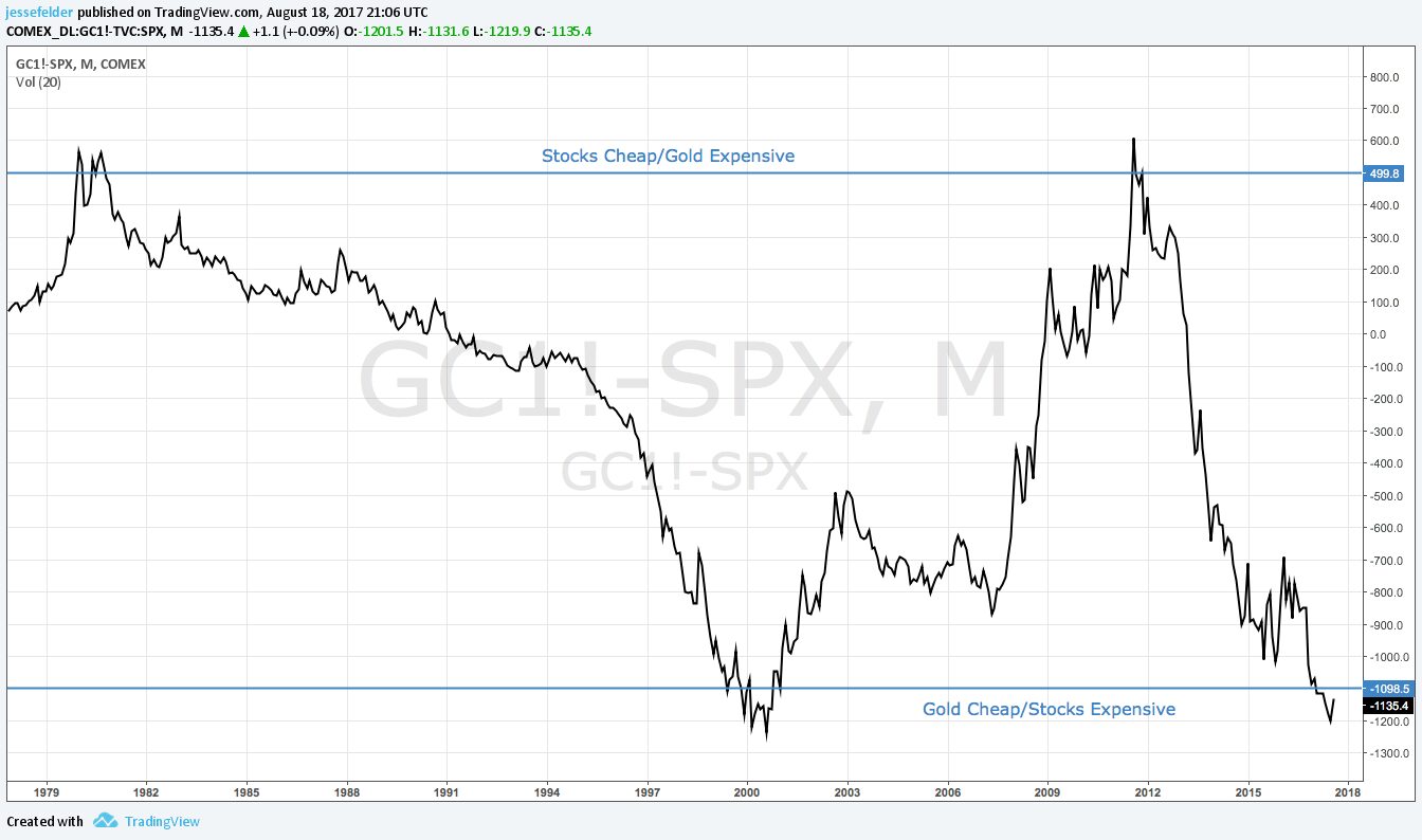
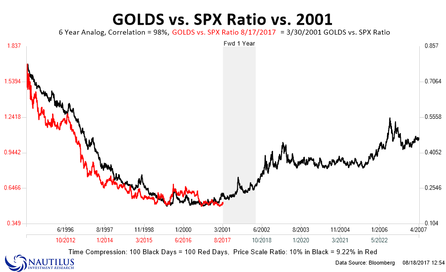
The chart above suggests the current environment is very similar to that of 2000. An analog of the gold/SPX ratio confirms this idea. There is 98% correlation between the 6 years ended today and the 6 years ended March of 2001, as gold was just starting to take off and stocks had just begun to rollover into a bear market.
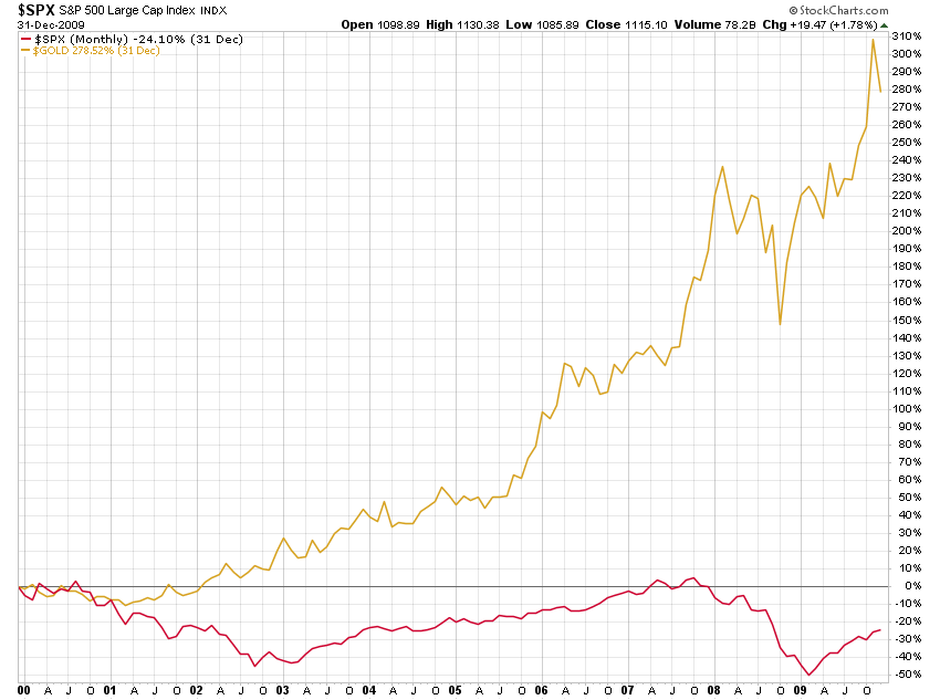
The decade following the 2000 peak saw a dramatic divergence in the performance of the two asset classes. The “lost decade” for equity investors was a period of plenty for precious metals investors. I think we are quite possibly on the cusp of another such period.
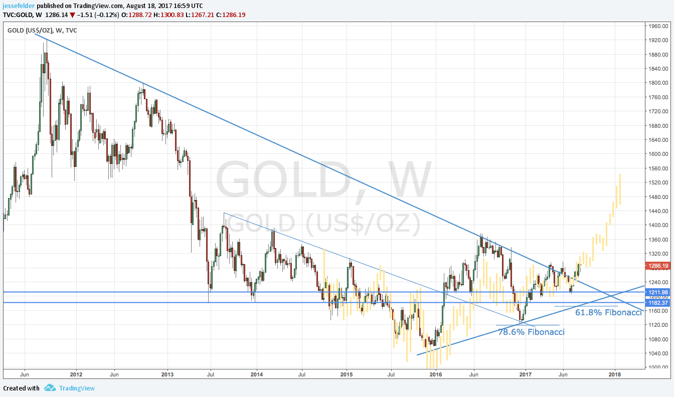
Turning to look specifically at gold, it rose this week to test the critical $1,300 level that has acted as important support and resistance at times over the past 18 months or so. It may take some time to overcome this but this is the third time it’s tested it in the past few months and it could prove to be a charm.

We are now in the middle of the seasonal sweet spot for gold so there is a decent possibility of it breaking out above the horizontal resistance at $1,300.

Longer-term, gold continues to follow the 2008-2009 price analog noted in yellow in the chart below. Most importantly the downtrend line is now definitively broken and on this time frame it looks like gold is forming a sort of head and shoulders bottom pattern.
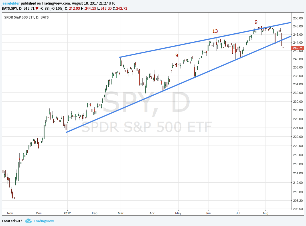
Turning to the other half of the story, the S&P 500 broke down out of its short-term bearish wedge pattern this week after completing a DeMark Sequential 9-13-9 sell signal. Technically, this suggests this ETF could give back its 2017 gains in short order. On Friday, it tried to rally and tested the underside of the lower trend line before reversing and closing lower. There is short-term support at the 240 level and I expect that to be tested soon.
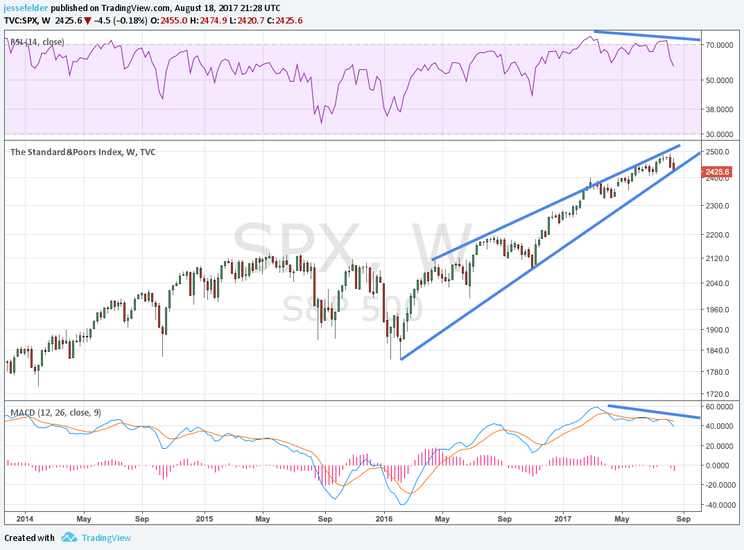
Longer-term there is another a bearish wedge pattern in play though the lower trend line in this one is still intact. If this breaks it will be a good sign that the current uptrend has come to an end and the index could be vulnerable to giving back all of the gains since the early-2016 low.
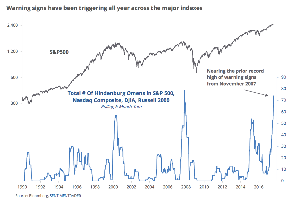
Making a strong case that this is part of a major topping process is the fact that a ton of Hindenburg Omens have been triggered across virtually every index recently (ht, SentimenTrader). The only other times we saw similar occurrences were at the 2007 and 2000 peaks. Essentially, this is just a breadth warning indicating that while the indexes remain near their highs there is a lot of deterioration below the surface in the individual components.
Certainly, the trend in breadth suggests this is likely to be, at the very least, a significant correction on par with those seen in 2011 and 2015.
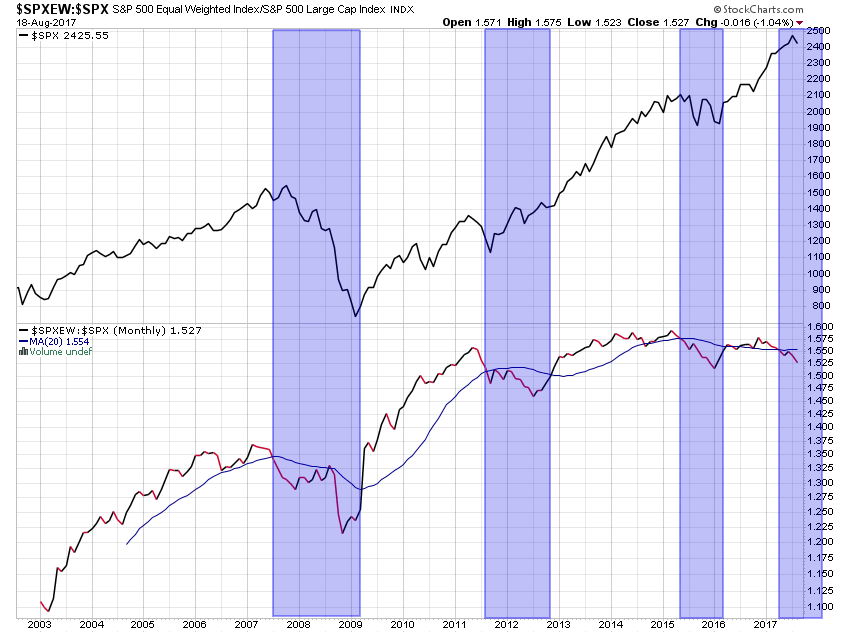
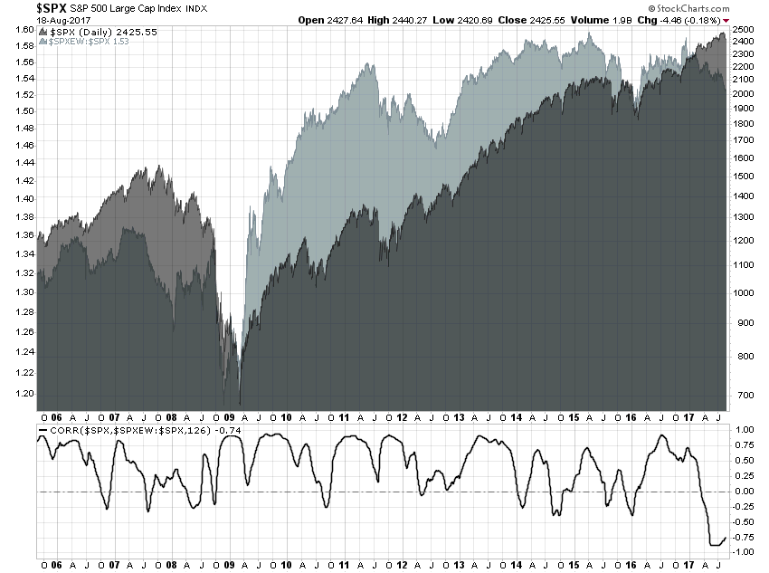
But the magnitude of the current divergence suggests a major bear market is more likely. We have never seen breadth deteriorate so badly at any point over the past decade, as measured by the ratio of the equal-weight S&P 500 to the conventional index.
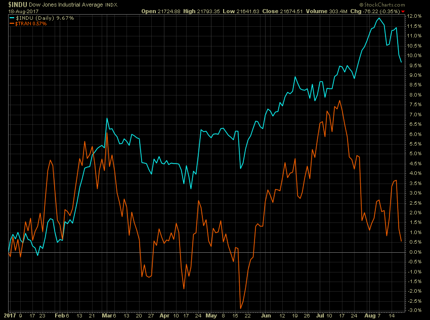
Looking at a few of the sectors and indexes responsible for these breadth divergences, as noted here recently, the Transportation Average recently triggered a Dow Theory warning.
And the Transports are acting very much like they did in 1937 just prior to the massive plunge that year. 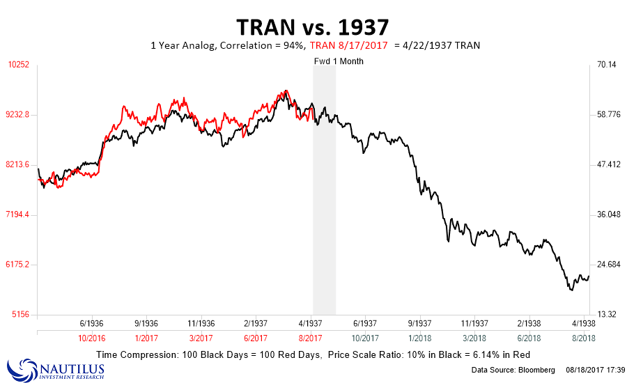
For more about this analog see this market comment:
Another index that has lagged is the small cap Russell 2000. In fact, it’s lagged so badly it’s now flat on the year.

This index is behaving much like it did leading up to the 1987 crash.
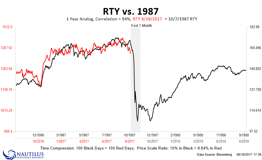
For more on this analog see this market comment:
One sector that has had an incredible run leading the broad stock market higher is the semiconductors, led by fan favorite Nvidia. This stock is up more than 50% year-to-date and nearly 200% over the past 12 months.
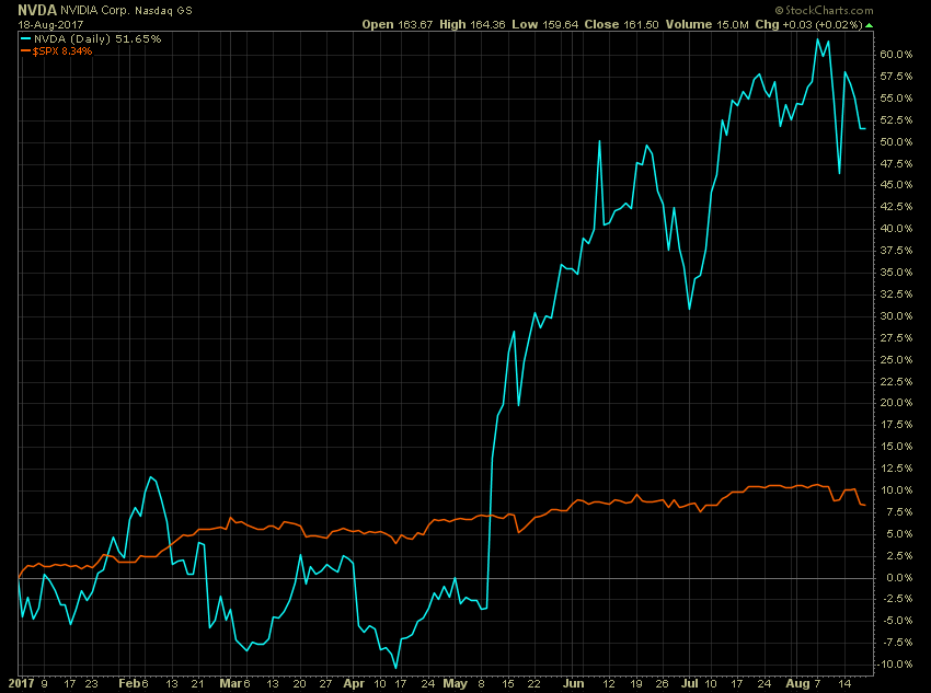
Folks, this is what the blowoff phase of a bubble looks like. Interestingly, NVDA looks almost exactly like the S&P 500 did at the peak in 1929 leading into the great crash.
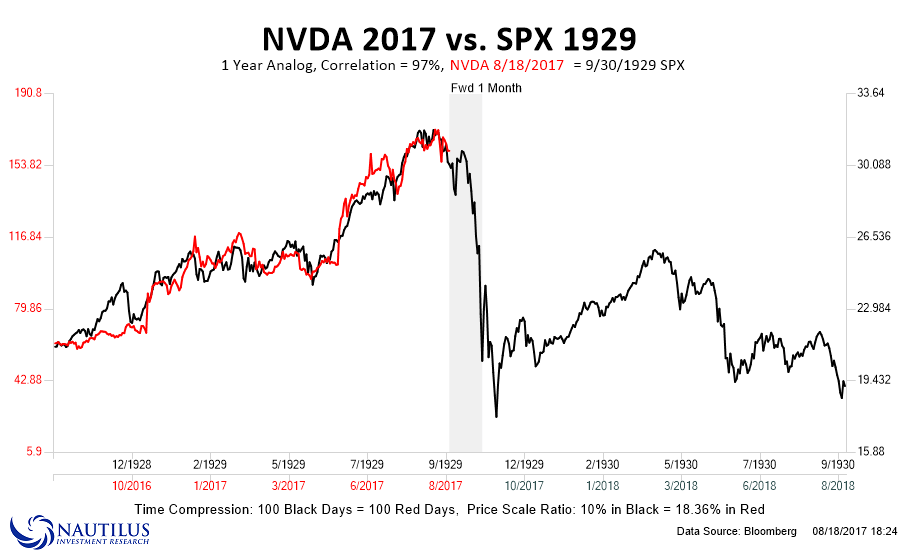
For more on this analog see this market comment:
It could get very interesting over the next few weeks as we head in the fall, typically a time of rising volatility. All in all, it appears gold and the stock market are very near major turning points that will set the stage for a new bull market in the former and another major bear market in the latter. And I’m positioned accordingly.