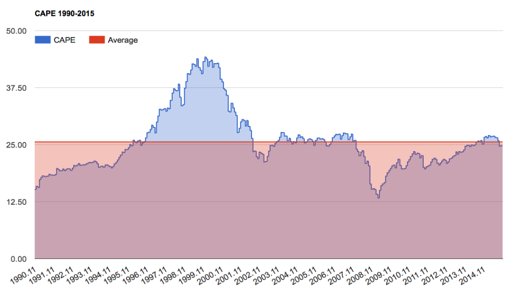
There’s a popular chart going around lately that proclaims, “stocks are not overvalued.” In making this argument, it relies entirely on the fact that the current CAPE ratio, developed by Nobel Laureate Robert J. Shiller, is now below its 25-year average.
There are two major problems with this argument. First, the last 25 years represent the highest sustained valuations in the history of our stock market. Second, these elevated valuations are built upon corporate profit margins which are also now extremely high relative to history. Thus, you should be comfortable with this measure only if you believe it reasonable to extrapolate both of these extreme phenomena indefinitely into the future (which I have argued is the single greatest mistake investors make).
Below, I’ve recreated the 25-year CAPE chart, taking the data directly from Shiller’s website. The CAPE ratio essentially reflects the price of stocks relative to their 10-year average earnings. Shiller chose this valuation method in order to dampen the effect of the business cycle. The shaded red area in the chart represents the 25-year average, of 25.6, and below. You can see the recent selloff has brought stocks back below the red line.
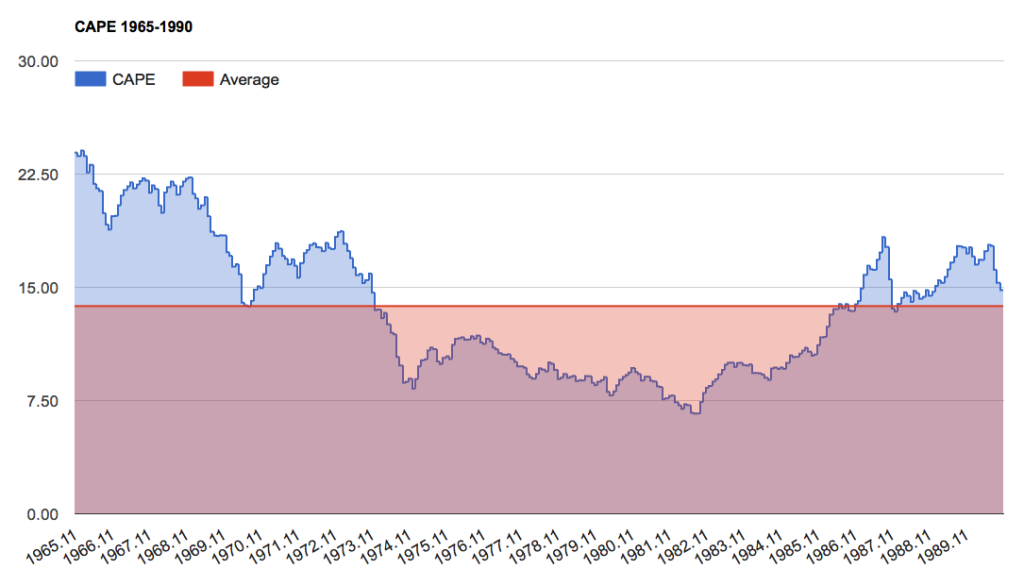
But let’s take a look at the prior 25 years. Clearly, based on their 10-year earnings, stocks were far cheaper during the 1965-1990 period than the were during the following 25 years. At a mere 13.76, the average CAPE during this earlier 25-year period was about half what it was during the most recent one. Excluding this period from study then has the effect of seriously inflating the final valuation average used in arguing, “stocks are not overvalued.”
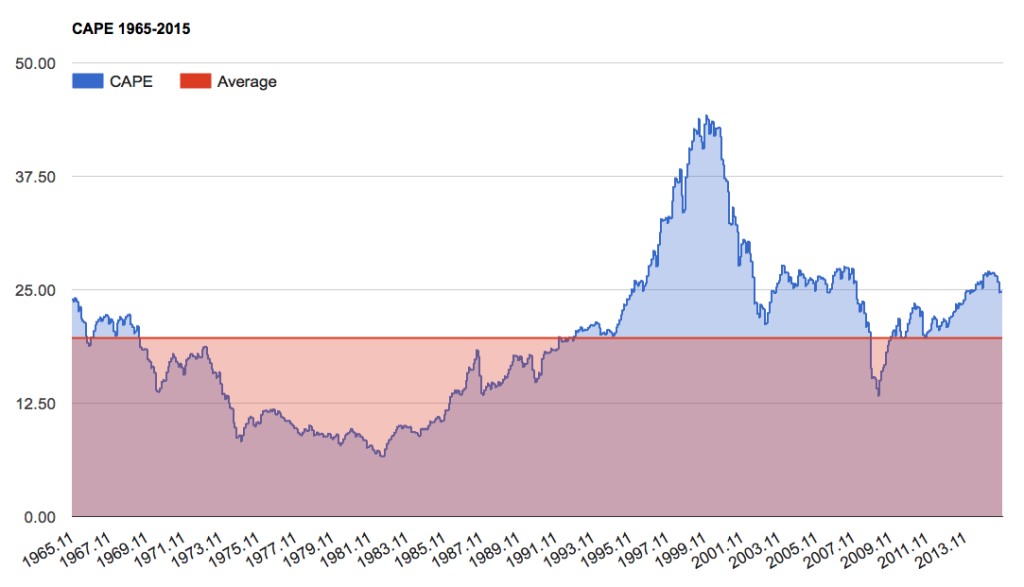
Now let’s look at the entire 50-year period. The average now moves to 19.68. Stocks don’t look extremely overvalued in this light but they are certainly well above this long-term average. (To illustrate just how expensive stocks are based upon this measure, if the S&P 500 was to immediately fall back to its 50-year average valuation, it would lose 23% of today’s value.)
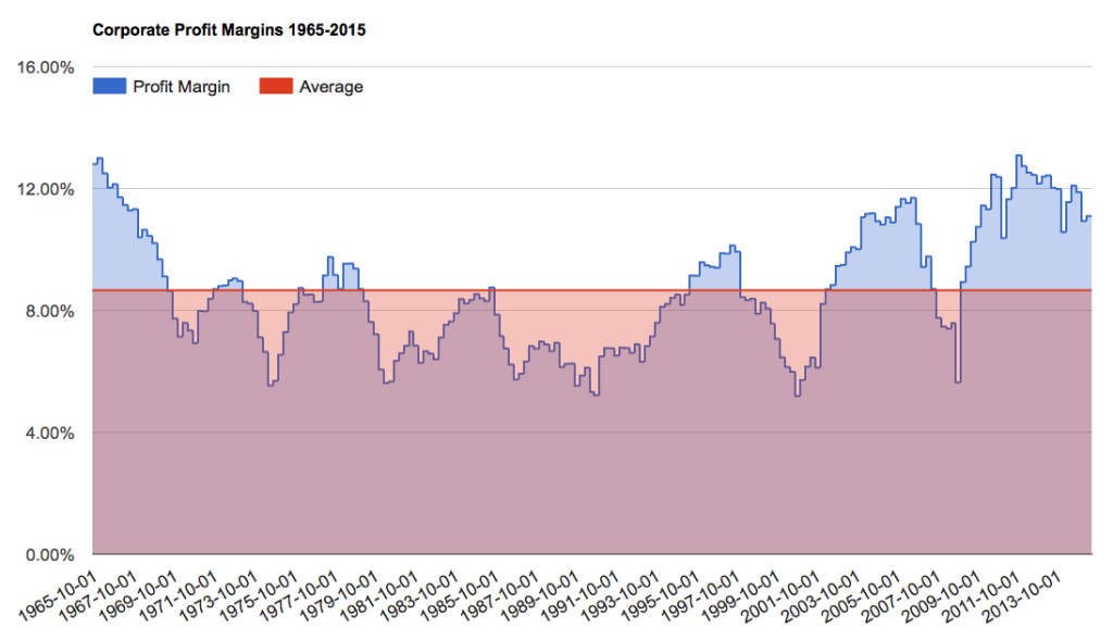
As I mentioned earlier, another problem with this measure is that it is built upon extremely high corporate profit margins. Both Warren Buffett and Jeremy Grantham have warned us that these are not sustainable for very long. In fact, Grantham recently called profit margins, “the most mean-reverting series in finance.” Should profit margins revert at some point in the future, they could potentially make stocks look far more overvalued in terms of earnings-based valuations measures like CAPE.
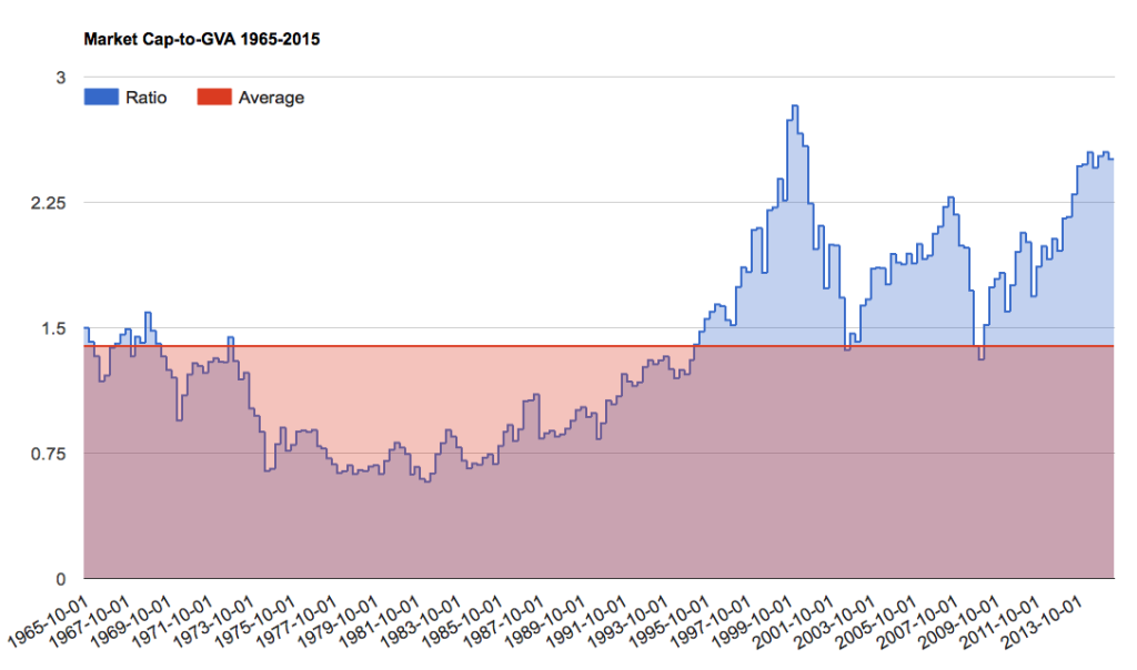
Now when we take a look at a valuation measure that negates the affect of record-high profit margins, the picture changes again. Below is a chart of a sort of price-to-sales measure, similar to Buffett’s market cap-to-GNP yardstick. The main difference is that it incorporates domestic corporate profits earned overseas, one of the most popular criticisms of Buffett’s favorite measure. I call it the Hussman Yardstick, as it was first introduced by John Hussman. What makes this measure most valuable is that it is more highly correlated to future 10-year returns than anything else I’ve found. Looking at the chart below, it becomes a lot harder to argue, “stocks are not overvalued.” (To illustrate just how expensive stocks are based upon this measure, if the S&P 500 was to immediately fall back to its 50-year average valuation, it would lose 44% of today’s value.)
And if forward returns are really what matter most to you, then this measure screams returns are going to be very poor in the future. The only time stocks were more overvalued than they are today was at the very peak of the dotcom bubble. Remember the “lost decade” that followed?
Now look back in these charts to that period from roughly 1975 to 1990. Then, stocks were inexpensive on earnings-based measures and this was on top of depressed profit margins. The returns going forward, as valuations and profit margins lifted, were fantastic. This was the tailwind that Peter Lynch had to work with. Today, we have the opposite situation. Stocks are expensive and this elevated valuation is built on top of inflated profit margins. If these both revert, they will make for a powerful headwind going forward.
Ultimately, the last 25 years represent two of the greatest financial bubbles in the history of the world. To use this period to extrapolate valuations into the future is wildly optimistic at best. And anyone using this chart to argue it’s a good time buy stocks is either tragically myopic or is being completely disingenuous.
