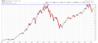
I first posted the chart below last fall when the stock market was testing its old 2000 highs.

Since then, stocks have sold off and today the S&P 500 is roughly trading at the same level it traded at almost 10 years ago. That’s just the price investors pay for the “Irrational Exuberance” of the late 1990’s.
This next chart shows the price-to-earnings ratio of the same index that dates back over 100 years – just about as long-term as you can get.

Looking at this chart, the stock market bubble is fairly obvious. Valuations at the peak in 2000 were four standard deviations out of whack, an ultra-rare, once-in-a-lifetime kind of event.
However, the chart shows that as of the end of last year, valuations are still streched (one standard deviation above average). Fundamentally, this argues for continued sub-par returns for stocks.
And if 10 years is still not enough time to work out the stock market bubble I wonder how long it will take to unwind the largest bubble in history.
The example of Japan may not be as far fetched as it seems. If nothing else, it certainly makes the current bottom-callers sound more than a bit premature.
Sources:
Online Data from the book Irrational Exuberance
Robert Shiller
Yale Department of Economics
In Come the Waves
The Economist