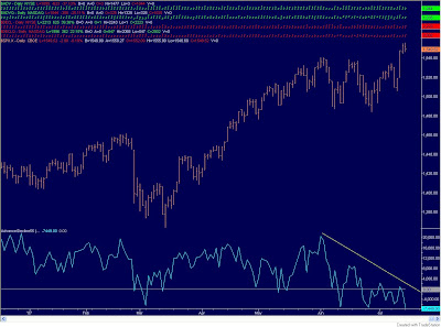
I just put together the chart above on stockcharts.com (click the chart for a better view). It shows each time over the past decade the MACD on the S&P 500 weekly chart has reached the current level. Now running back up to its 2000 (mania) highs the Index is looking a little overbought.
At the same time, the Advance-Decline Line (AD) that I track has failed to confirm the Index’s recent push to new highs.

The two together suggest that further gains from here are improbable, at best.
The MAC D(AD) will make you… What? What?
[youtube http://www.youtube.com/watch?v=4UgficQpYE4]LIV