Here’s an interesting chart I put together today that coalesces a few posts I’ve done over the past few months:
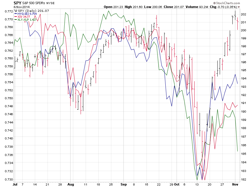
It plots the S&P 500 ETF (red and black bars), which recently hit a new, all-time high, alongside:
- Junk bond risk appetites – blue line (see: “Obscene Risk Hidden In Plain Sight“)
- The inverse volatility ETF – red line (see: “Crowded Trade Du Jour: Short Volatility“)
- Consumer discretionary ETF vs. Consumer staples ETF – green line (see: “TFR: Stocks, Gold & China” – technically this was a newsletter, not a post – subscribe here)
Clearly none of these indicators have kept pace during the rally over the past few weeks. Have stocks overshot the mark or will these indicators now play catch up? Or maybe they just don’t matter anymore. Who knows?