
It was over three years ago that Ray Dalio first proposed his 1937 analog. After the presidential election, he refreshed it in the context of growing global populism so that it looks like this:
- Debt Limits Reached at Bubble Top, Causing the Economy and Markets to Peak (1929 & 2007)
- Interest Rates Hit Zero amid Depression (1932 & 2008)
- Money Printing Starts, Kicking off a Beautiful Deleveraging (1933 & 2009)
- The Stock Market and “Risky Assets” Rally (1933-1936 & 2009-2017)
- The Economy Improves during a Cyclical Recovery (1933-1936 & 2009-2017)
- The Central Bank Tightens a Bit, Resulting in a Self-Reinforcing Downturn (1937)
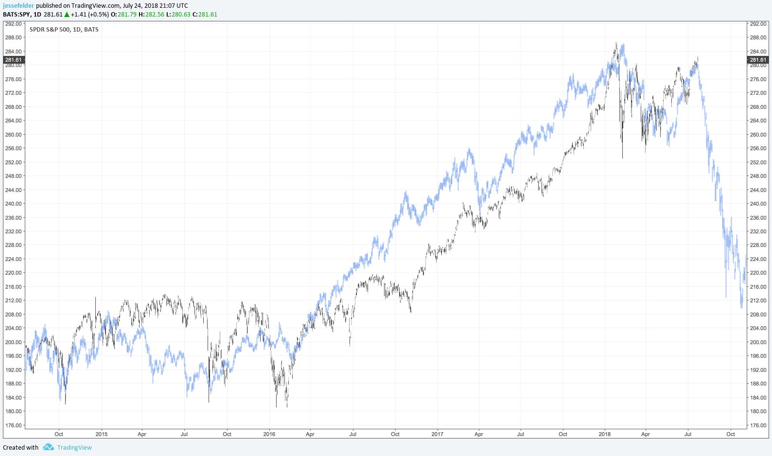
And if these fundamental parallels weren’t enough, we now have a rather interesting price parallel to consider. The correlation between the S&P 500 over the past four years (black and white candles in the chart below) and the four years leading up to the 1937 top (blue candles) is roughly 94%. As I have suggested in the past, price analogs are not very valuable on their own but when the fundamentals also parallel closely they become far more interesting.
In this case, the fundamental parallels are only getting tighter as time passes. Despite the yield curve currently sending a clear red flag, the markets are now pricing in better than even odds of two more rate hikes this year. It seems ‘central bank tightening into a self-reinforcing downturn’ is becoming a more distinct possibility as the economic cycle ages and inflation pressures grow. In other words, “the policy stakes are now very high,” and history provides a clear road map for markets.